In February 2024, as I was boxing up my Paul Elder exhibition at the Book Club of California, Kevin Kosik, the Club’s Executive Director, put a bug in my ear. “I think the Board of Directors would be receptive right now to a book proposal,” he said. “Strike while the iron is hot, so to speak.” So I did! And on Monday, my book was released at a splendid reception at the Book Club’s headquarters in San Francisco.
The Book Club staff laid out tasty platters of food, and concocted a special “Western Publisher” cocktail for the evening: prosecco and elderberry liqueur, with a slice of lemon. About sixty Club members and guests were in attendance. My special guests were Paul Elder’s granddaughter Jean Rodgers, Jean’s daughter Meg, and Bruce Smith of the Arts & Crafts Press, who wrote the foreword to my book.
At 6pm the presentations began, with many people joining on Zoom. As my 2023 Karmiole Lecture covered Elder’s biography and his bookstores, this time I chose to speak about his books. I titled my talk “Twelve Paul Elder Books You Should Read, Despite Rumors You’ve Heard that Elders Aren’t Worth Reading.” The book designers, Allwyn O’Mara and Carmel O’Mara-Horwitz, then spoke about their experience in designing the book, their first book designed solely with digital tools.
The special “Western Publisher” cocktailGiving my talk about “Twelve Elders You Should Read”My friend Bruce Smith, of the Arts & Crafts Press, who wrote the foreword.Jean Rodgers, Paul Elder’s granddaughter, and her daughter MegThe book designers, Carmel O’Mara-Horwitz, and Allwyn O’MaraBruce Smith and my wife Arlene BaxterSigning a book for a Club member
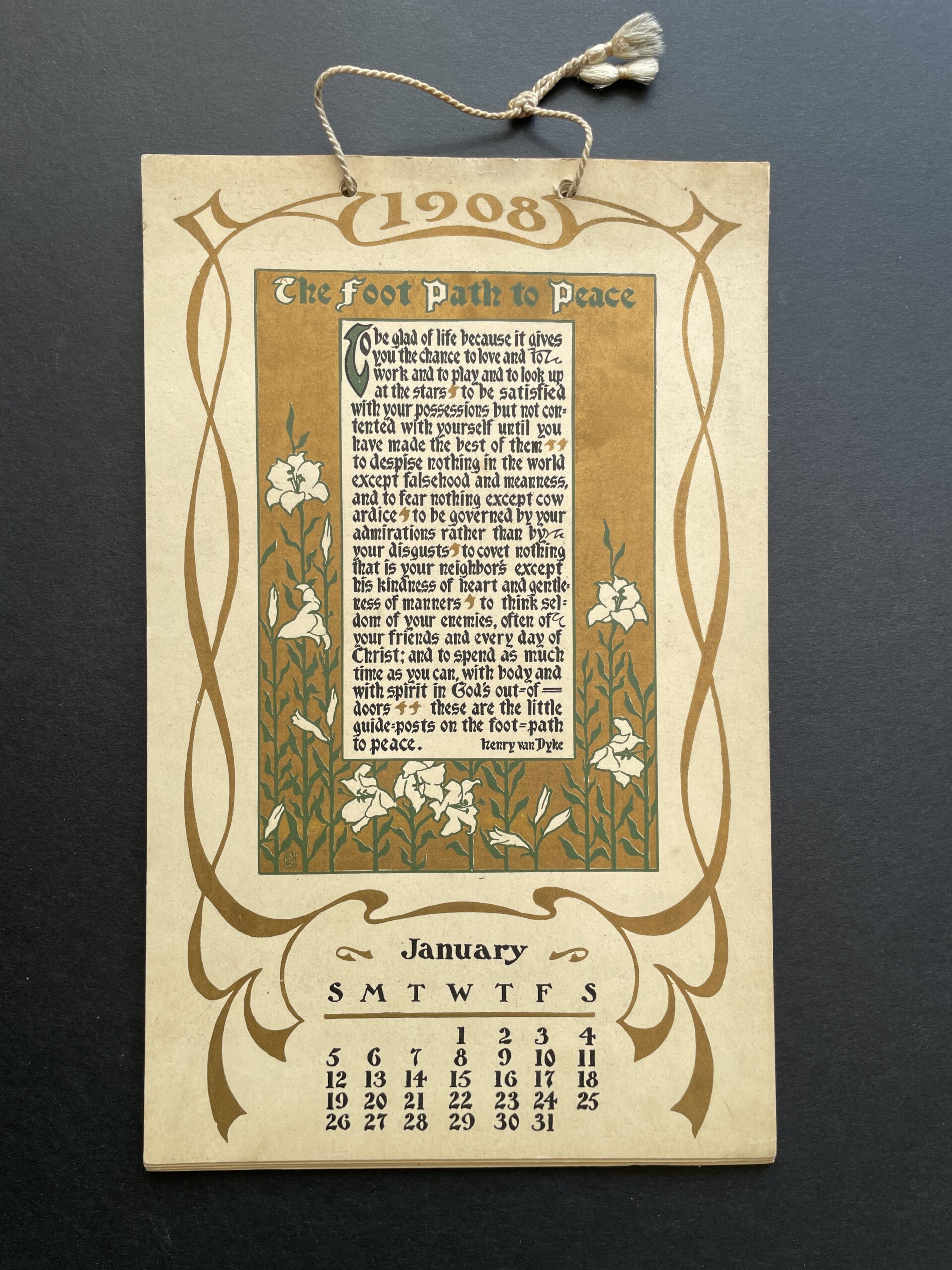
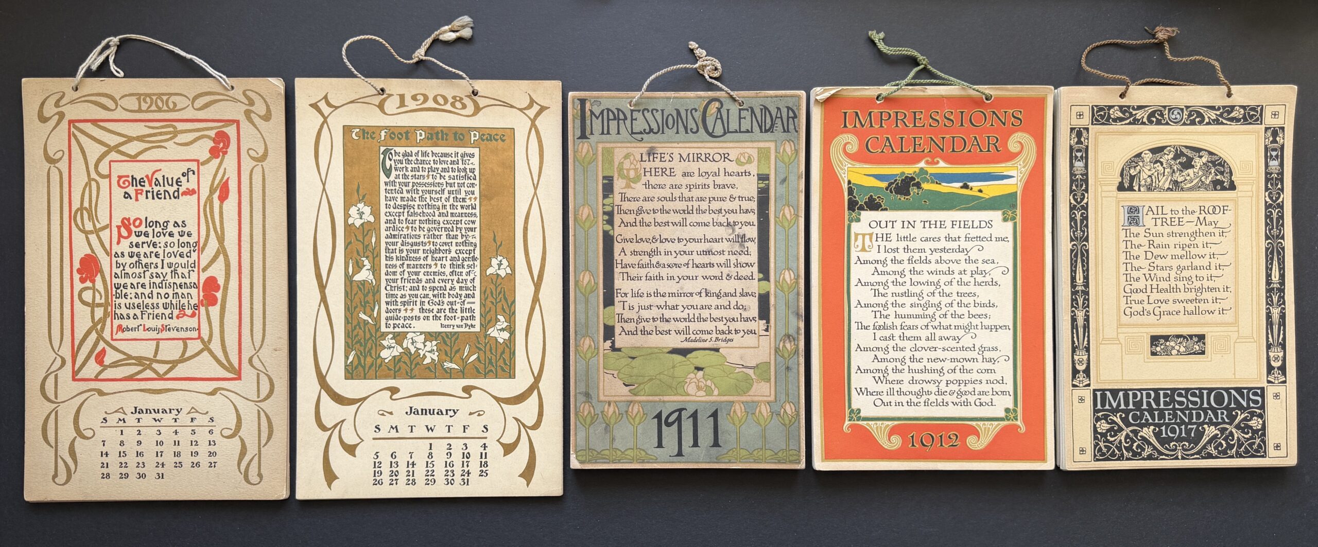
The most complex of Paul Elder’s ephemeral output were his many calendars. The Impressions Calendars was Elder’s longest-running and most successful calendar series. It debuted in 1902 and lasted at least through 1918. Printed in multiple colors on heavy card stock in order to hold up to constant handling, they were threaded with a sturdy cord for hanging on a wall.
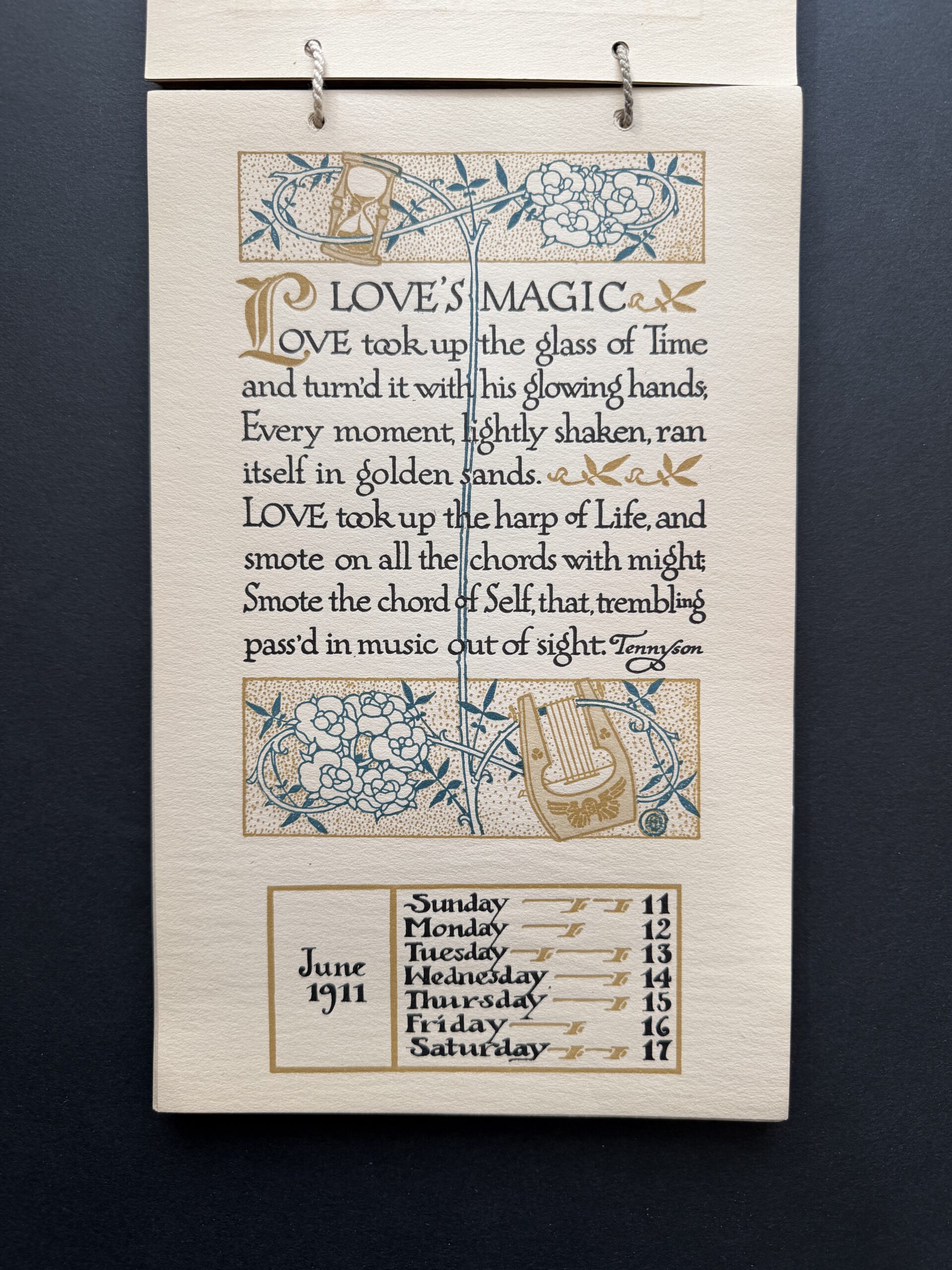
The design was a familiar one: a tall portrait format, with artwork above and the calendar below. Originally there were twelve leaves, one per month, with the January leaf on top. By 1911, the format had changed to 54 leaves, one per week plus a title page on top and a colophon page at the bottom. The page-per-week calendars were sold in a matching box, which rarely survives. In 1918, the format changed again to two weeks per page, no doubt due to the skyrocketing price of paper, which was in turn one of the many side effects of World War I.
The New York Times was complimentary about the 1911 calendar:
The week of 11 June 1911. Artwork by Harold Sichel
The Impressions Calendar, (San Francisco: Paul Elder & Co., 50 cents, postage 10 cents) deserves the palm among American calendars for artistic beauty and distinctive quality. It has a page for each week of the year, with an impressionistic design, different for every page, as a background or margin for the quotation. These designs are in soft, pleasing colors and present the greatest variety of ideas and themes, from bits of conventionalized flower decorations to glimpses of landscapes. They are by Harold Sichel, Spencer Wright, and Charles Frank Ingerson. The quotations, which, with the illustrations, fill three-quarters of each page, are in prose and verse from famous authors, and have been selected with an eye both for literary grace and heartening message.1New York Times, 3 December 1911, p804
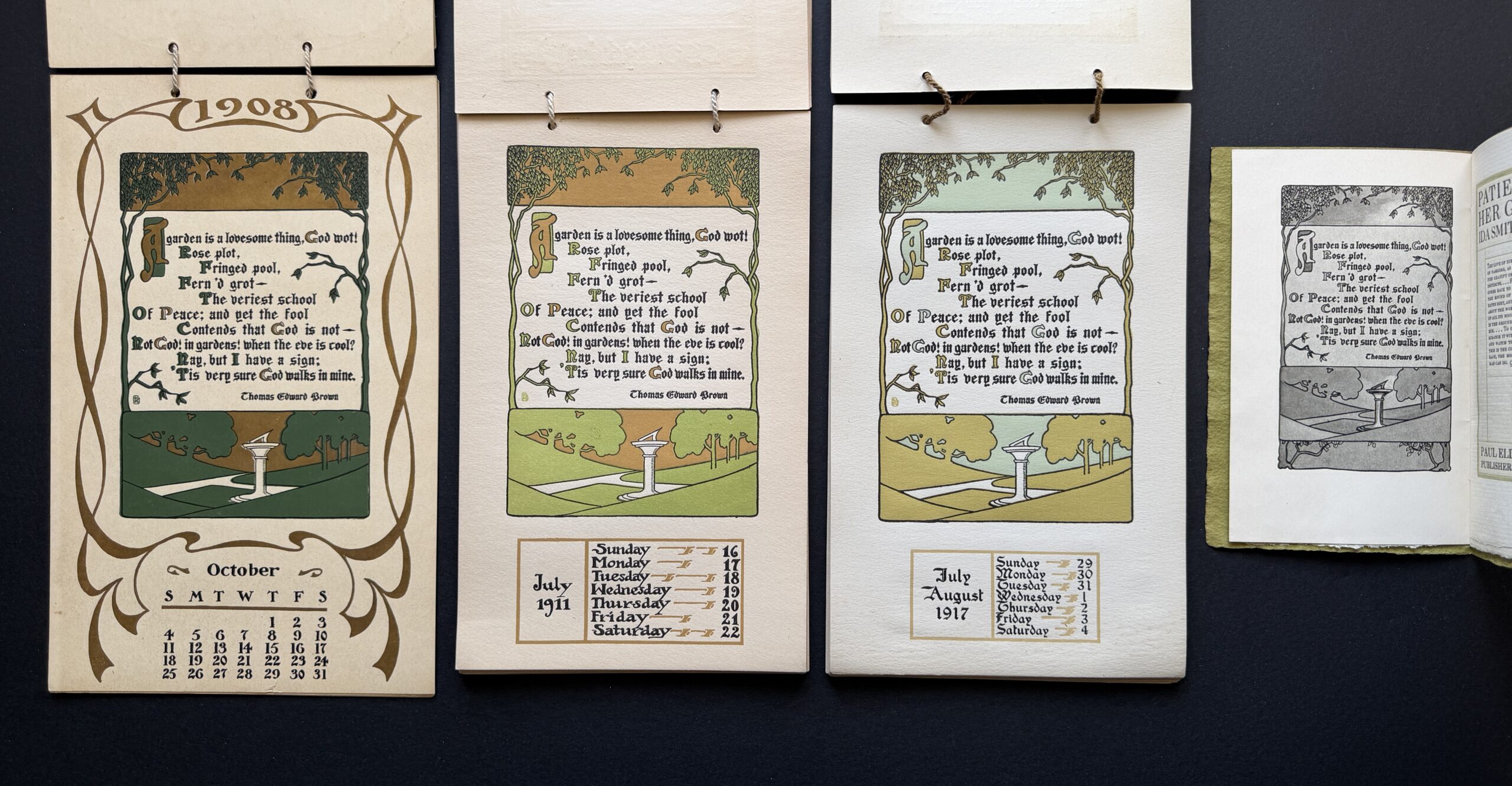
Thomas Edward Brown’s “A Garden is a lovesome thing,” with artwork by Spencer Wright, printed in three different color palettes in 1908, 1911, and 1917. The same image (in greyscale) was also used as the frontispiece to Patience and Her Garden in 1910.
The move from 12 to 54 pages, of course, meant 42 additional pages of artwork. Artwork for the Impression Calendars went hand-in-hand with artwork for the Impression Leaflet series. Most of the images appeared in both, though it’s not clear whether a given image appeared first as an Impression Leaflet and was subsequently used in an Impressions Calendar, or vice versa. Artwork may well have flowed in both directions.
As the calendar series matured, the subtlety and quality of the artwork also matured. Early calendar art often featured typeset text, enclosed in a simple frame, with an illuminated capital as the chief artist element. By the mid-1910s, almost every page was hand-lettered, with a text box surrounded by sophisticated artwork.
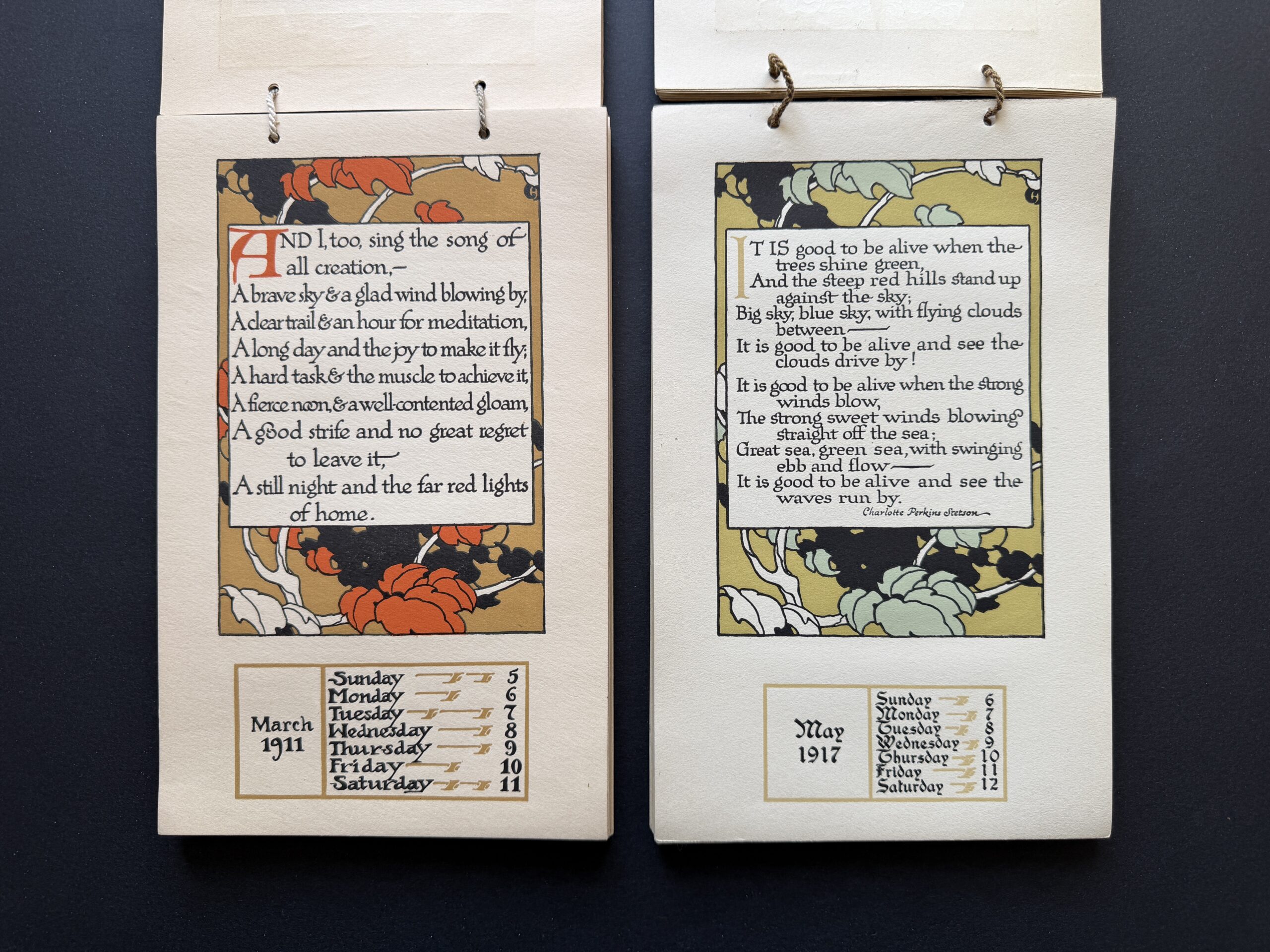
Artwork by Harold Sichel, printed in two color palettes in 1911 and 1917, but with different quotations in the central box
There was considerable repetition of the artwork from one year to the next, though to mitigate this a given image would often be printed in a different palette. However, over time, new images gradually replaced older ones. Whereas the 1912 calendar reused 51 of the 52 weekly pages in the 1911 calendar, the 1917 calendar only retained 17 of the 1911 images. Sometimes, artwork would be reused, but with new text in the center box.
The quotations were almost certainly compiled by Paul Elder himself. The Impressions Calendars series reinforces your editor’s long-held conviction that Robert Louis Stevenson was Elder’s favorite author. For example, five of the twelve quotations in 1906 are Stevenson’s, as are eleven of the 54 in 1911 and 1912—no one else comes close. Other 19th-century authors who appear frequently include Robert Browning, Alfred Tennyson, and Edward Rowland Sill (professor of English at the University of California, Berkeley from 1874 to 1882). A survey of five calendars yields a total of 65 different authors and poets.
Impressions Calendars from 1906, 1908, 1911, 1912, and 1917
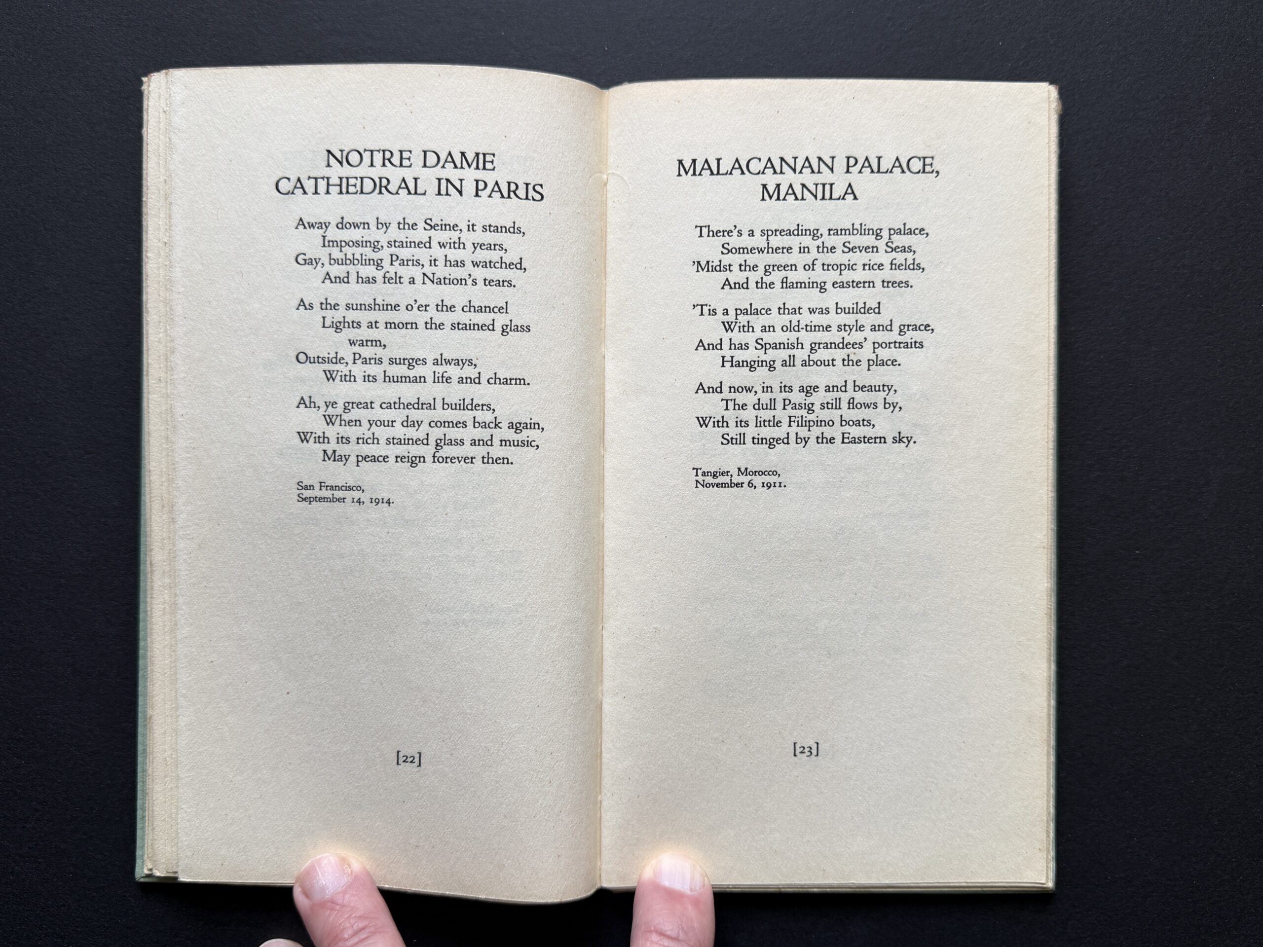
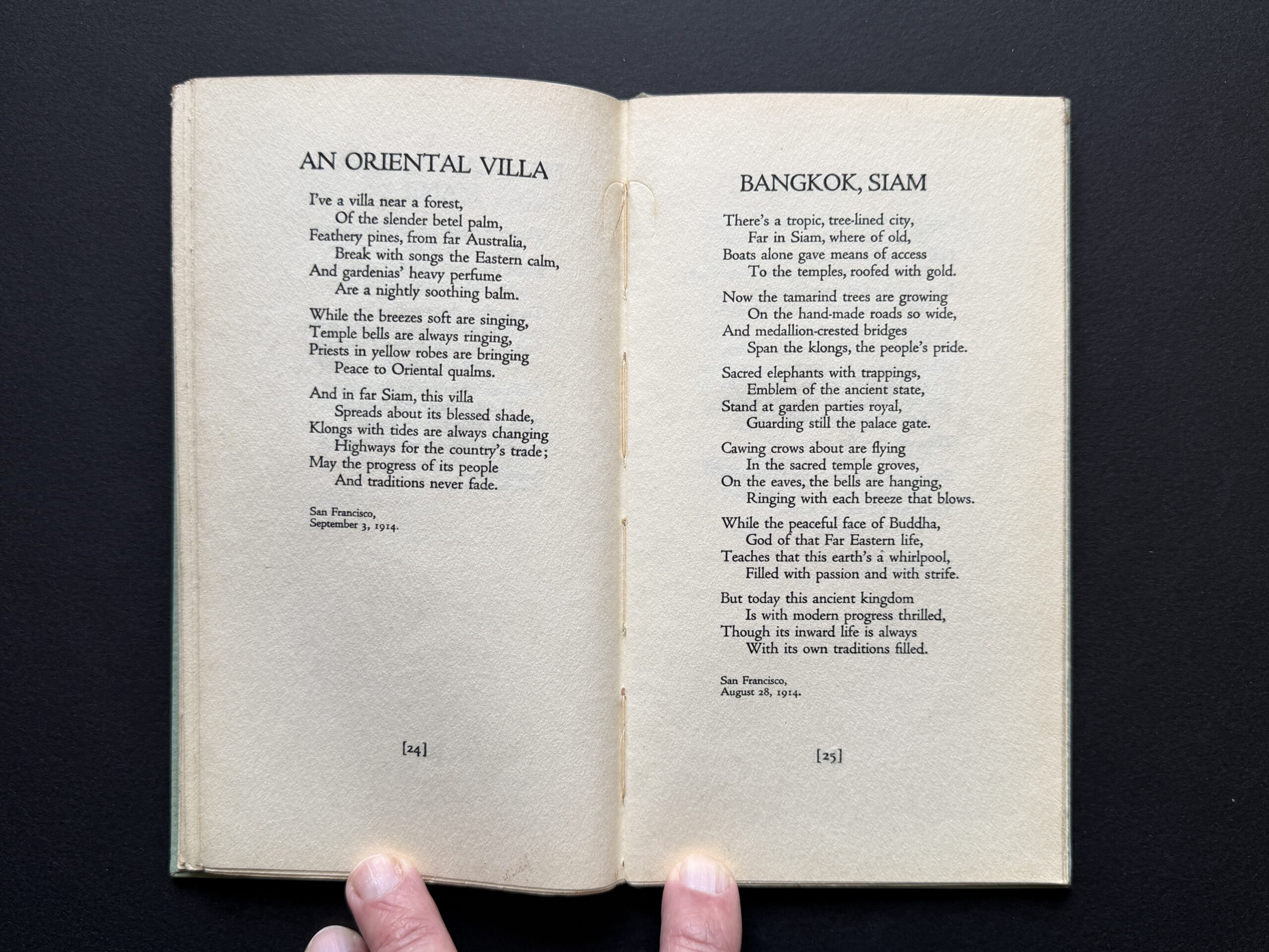
Fred Warner Carpenter had an eventful life: secretary to a President, diplomat to Morocco and Siam (now Thailand). Between 1911 and 1914, he composed a number of poems about those places and his experiences there. In November 1914, Paul Elder published Carpenter’s collected poems as Verses from Many Seas. The poems are pleasant if simplistic, with few risks taken, and return often to the same poetic meters.
Frederick Warner Carpenter was born on 12 December 1873 in Sauk Centre, Minnesota, the son of Ira M. Carpenter, a farmer, and Eva Augusta Wright. The family moved to California when Fred was twelve, and he spent his teenage years on a ranch near San Luis Obispo. After attending public schools and a local academy, returned to the University of Minnesota to study law, and was admitted to the bar in Minnesota and California in 1898.1New York Times, 6 March 1909, p1 He worked as a stenographer to Charles S. Wheeler at Bishop & Wheeler in San Francisco, before resigning to take the job that would launch his career: stenographer to federal judge William Howard Taft as he headed to the Philippine Islands as chairman of a commission to organize a civilian government. When Taft was installed as Philippines governor in 1901, Carpenter became his private secretary. Carpenter remained Taft’s secretary as he was appointed Secretary of War in 1904, then elected President of the United States in 1908.2Marquis’s Who Was Who in America, Volume V, 1969-1973, p117
Title page of Verses from Many Seas
On Taft’s first day as President, 6 March 1909, the New York Times described Carpenter as Taft’s “veritable shadow.” His long association with Taft came to an abrupt end on 27 May 1910, when Carpenter resigned his post in order to become Envoy Extraordinary and Minister Plenipotentiary to Morocco. Officially, a White House statement said that “the appointment of Carpenter to Morocco was made on his own application to be relieved of the duties of secretary to the president, which had been so heavy upon him as to threaten his health. The president thought that as Morocco has a delightful climate the change of duty which this would afford was wise and consented to Carpenter’s resignation of this present position.” Behind the scenes, as reported by the Call, Taft was likely embarrassed by a statement Carpenter issued about embattled Interior Secretary Ballinger, as well as the transmission of a list of congressmen that had met with Taft during his trip to the South. Essentially, Carpenter was being “kicked upstairs.”3San Francisco Call, 28 May 1910, p1
Carpenter was officially received by a representative of the Sultan two months later, on 27 July. In September 1912, he left Morocco to become Envoy Extraordinary and Minister Plenipotentiary to Siam, which he held until November 1913.4https://history.state.gov/departmenthistory/people/carpenter-fred-warner, accessed 28 Jan 2026 By 1917, he is working at the Mission Savings Bank at 16th and Valencia in San Francisco, perhaps as their attorney. By 1930, he appears to have retired.
Carpenter never married and had no children. He died on 27 August 1957 at his home in San Anselmo in Marin County, and is buried at the Kelseyville Cemetery in Kelseyville, Lake County, California.
In the printed checklists and indexes, Carpenter’s name is mistakenly given as Fred Carpenter Warner.
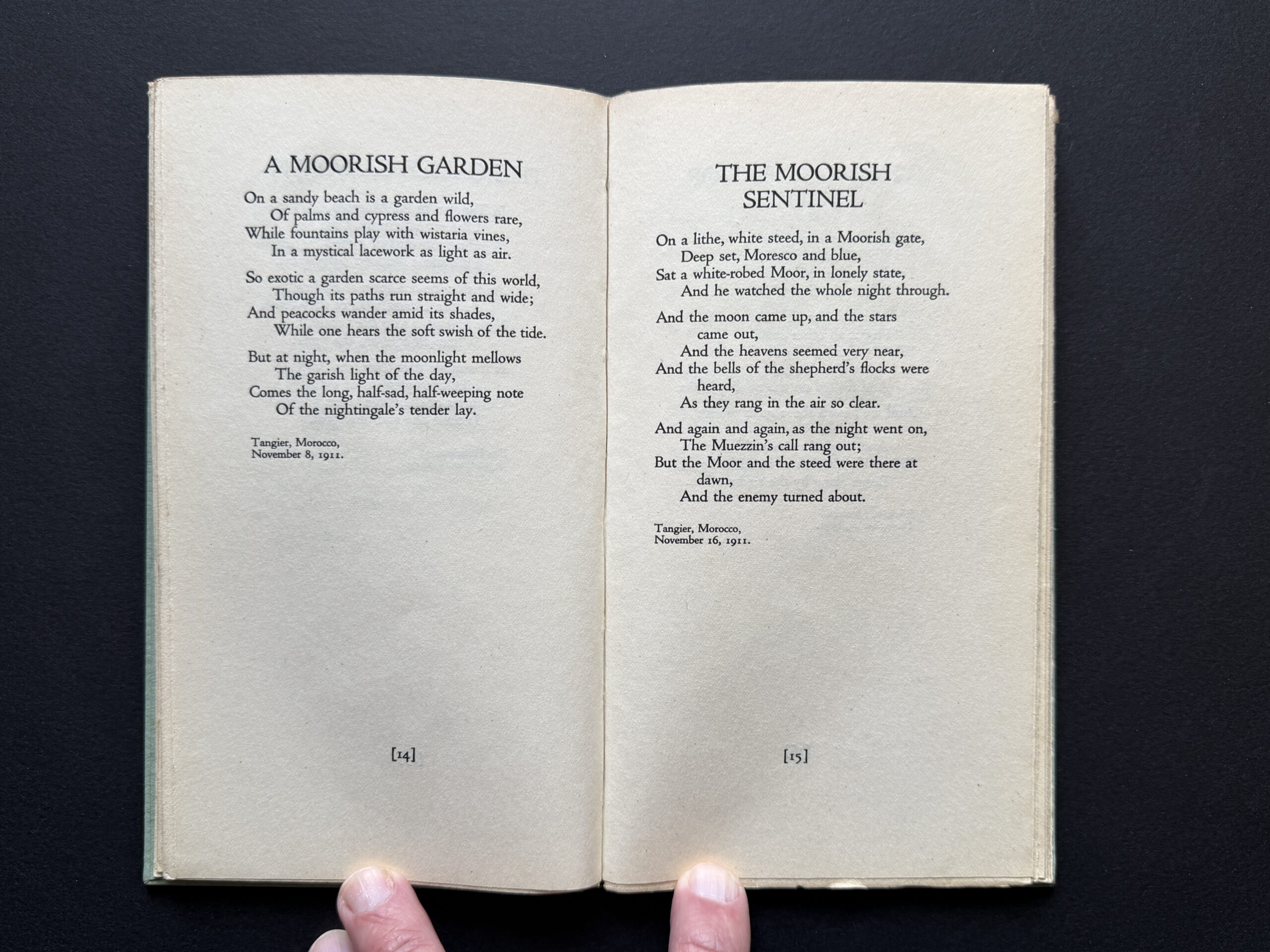
Pages 14-15 of Verses from Many SeasPages 22-23 of Verses from Many SeasPages 24-25 of Verses from Many Seas
1
New York Times, 6 March 1909, p1
2
Marquis’s Who Was Who in America, Volume V, 1969-1973, p117
3
San Francisco Call, 28 May 1910, p1
4
https://history.state.gov/departmenthistory/people/carpenter-fred-warner, accessed 28 Jan 2026
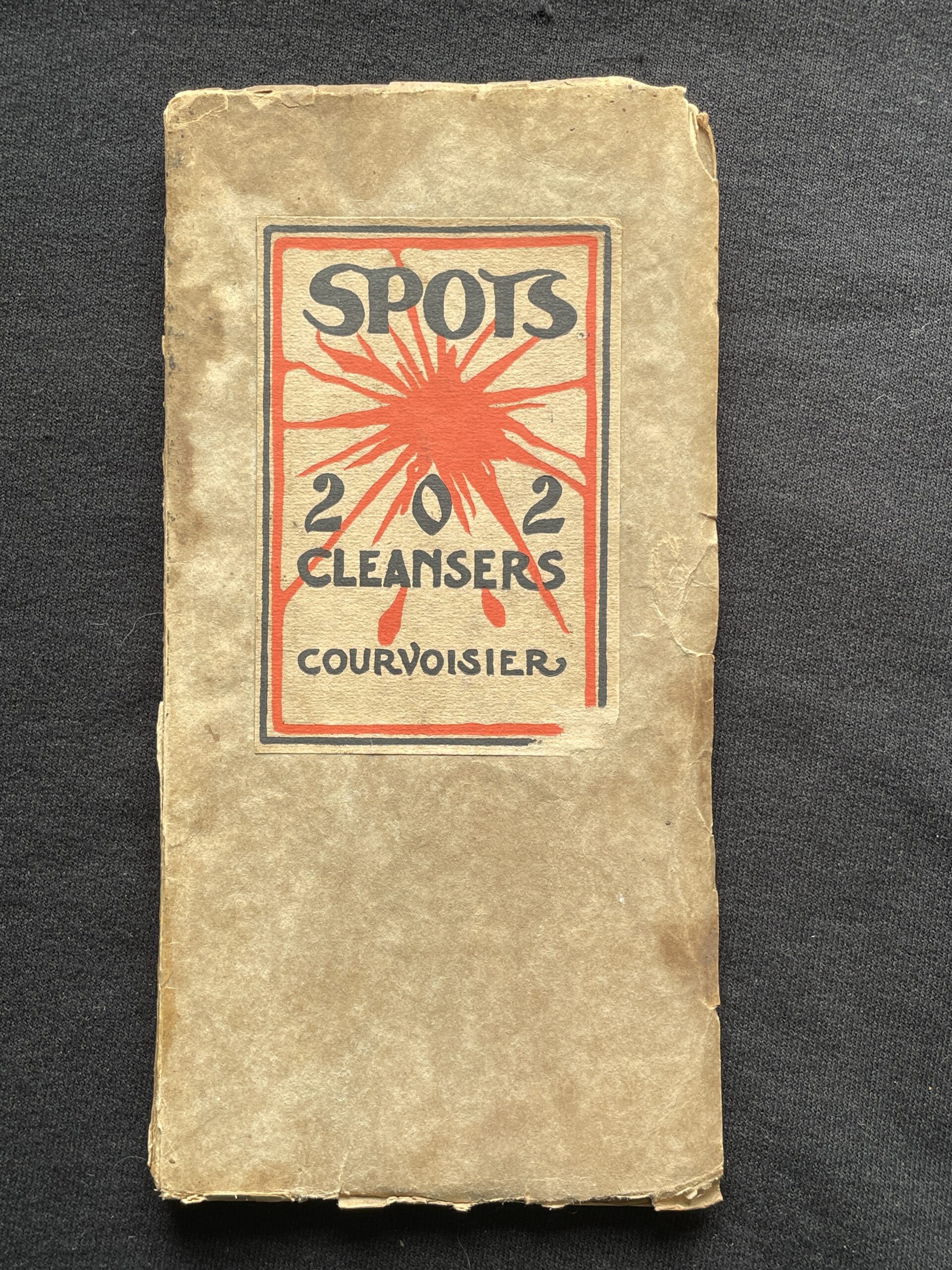
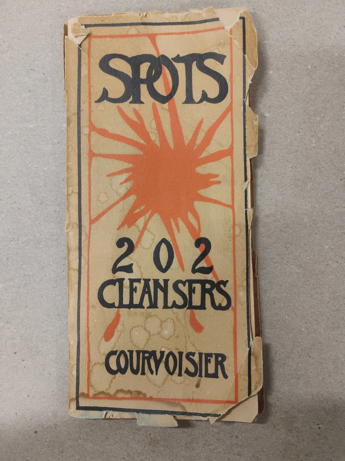
Spots, or Two Hundred and Two Cleansers (1906) is an obvious sequel to May Southworth’s 101 Epicurean Thrills series, with the same format and internal design as the cookbooks throughout. However, this book was not compiled by Southworth, but instead by Clarice T. Courvoisier. In 1906, Clarice was thirty-four years old and newly married. It’s unknown how she was commissioned to write the book, but a reasonable guess is that Southworth and Courvoisier knew each other socially.
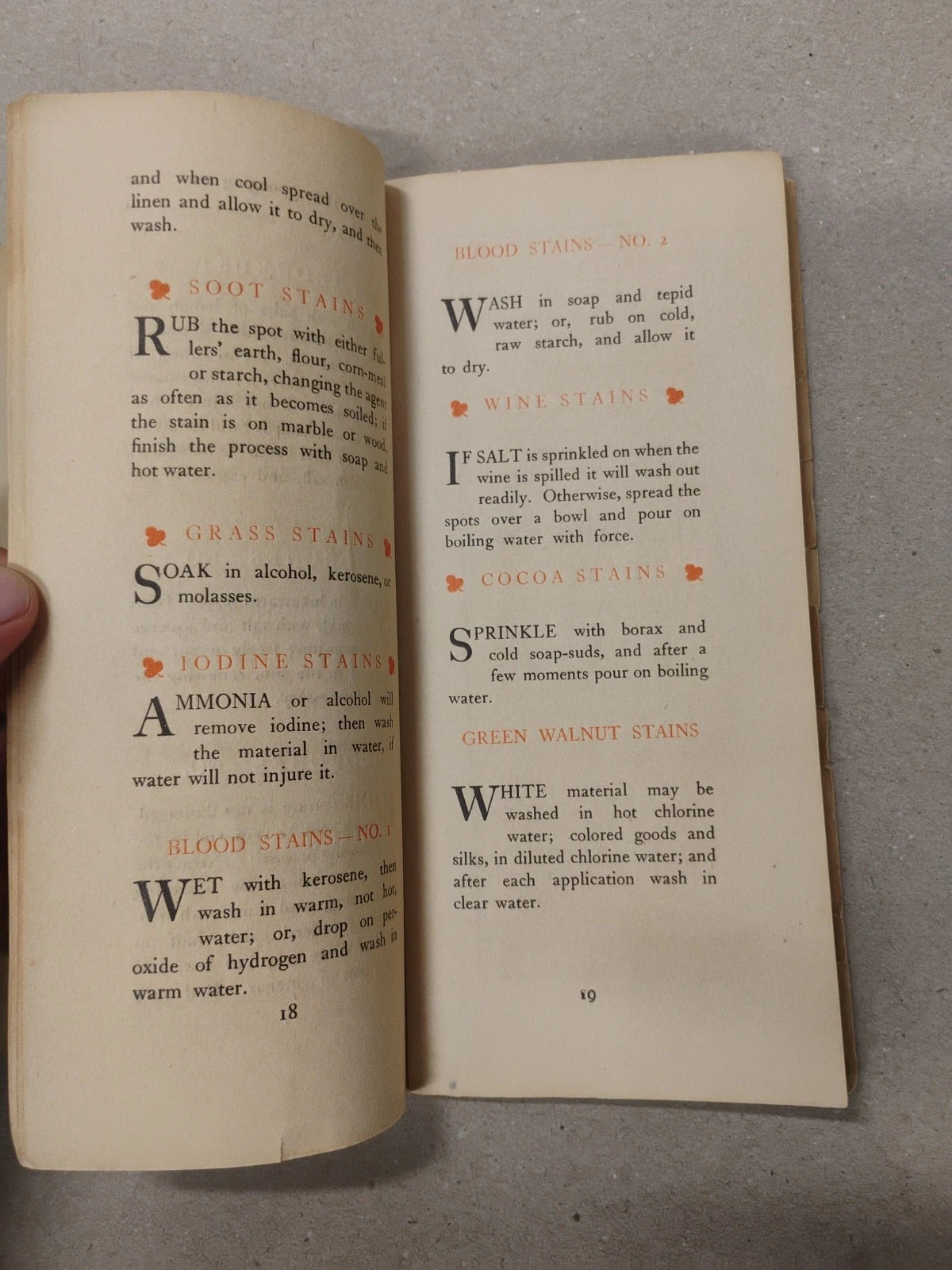
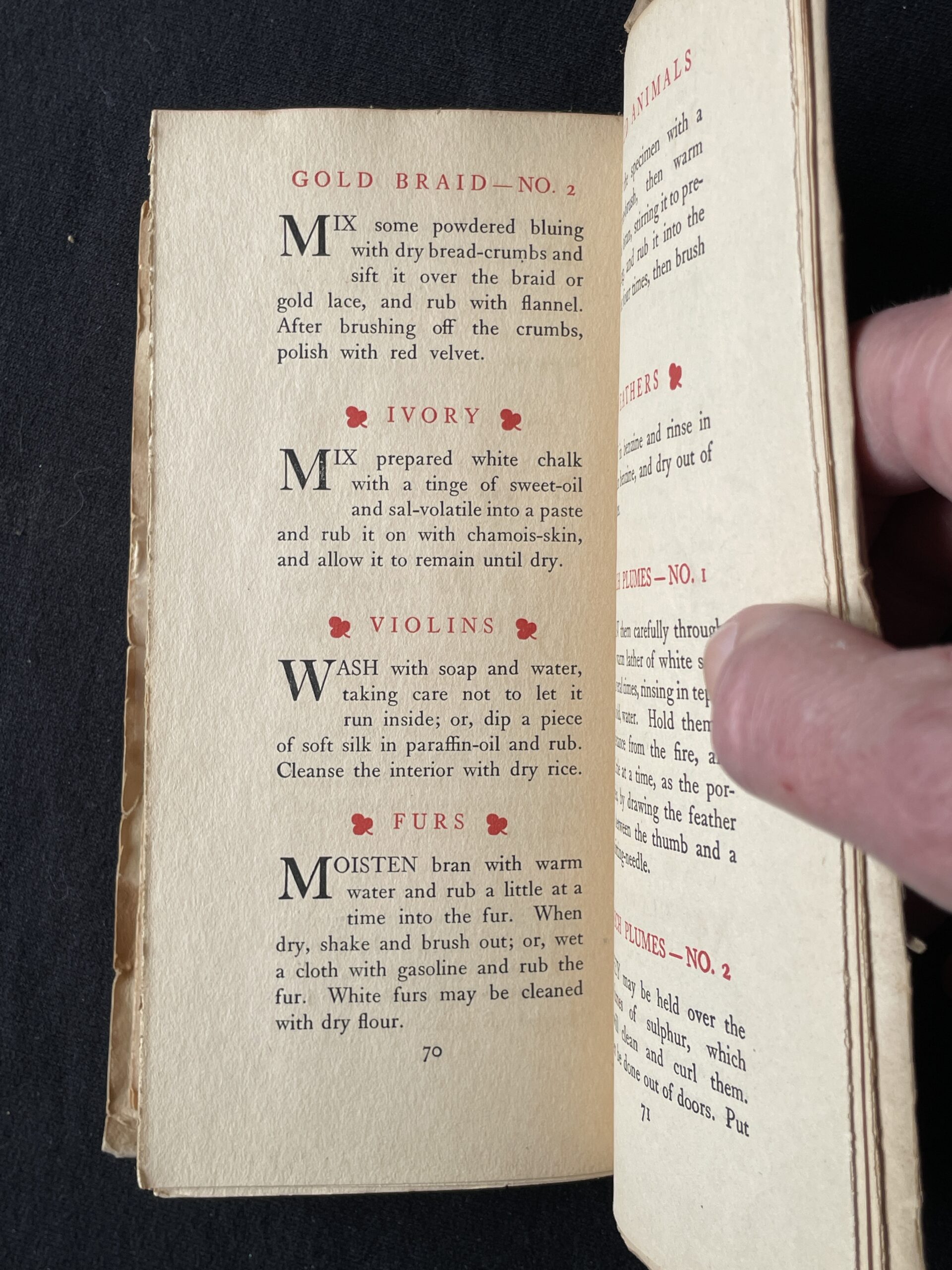
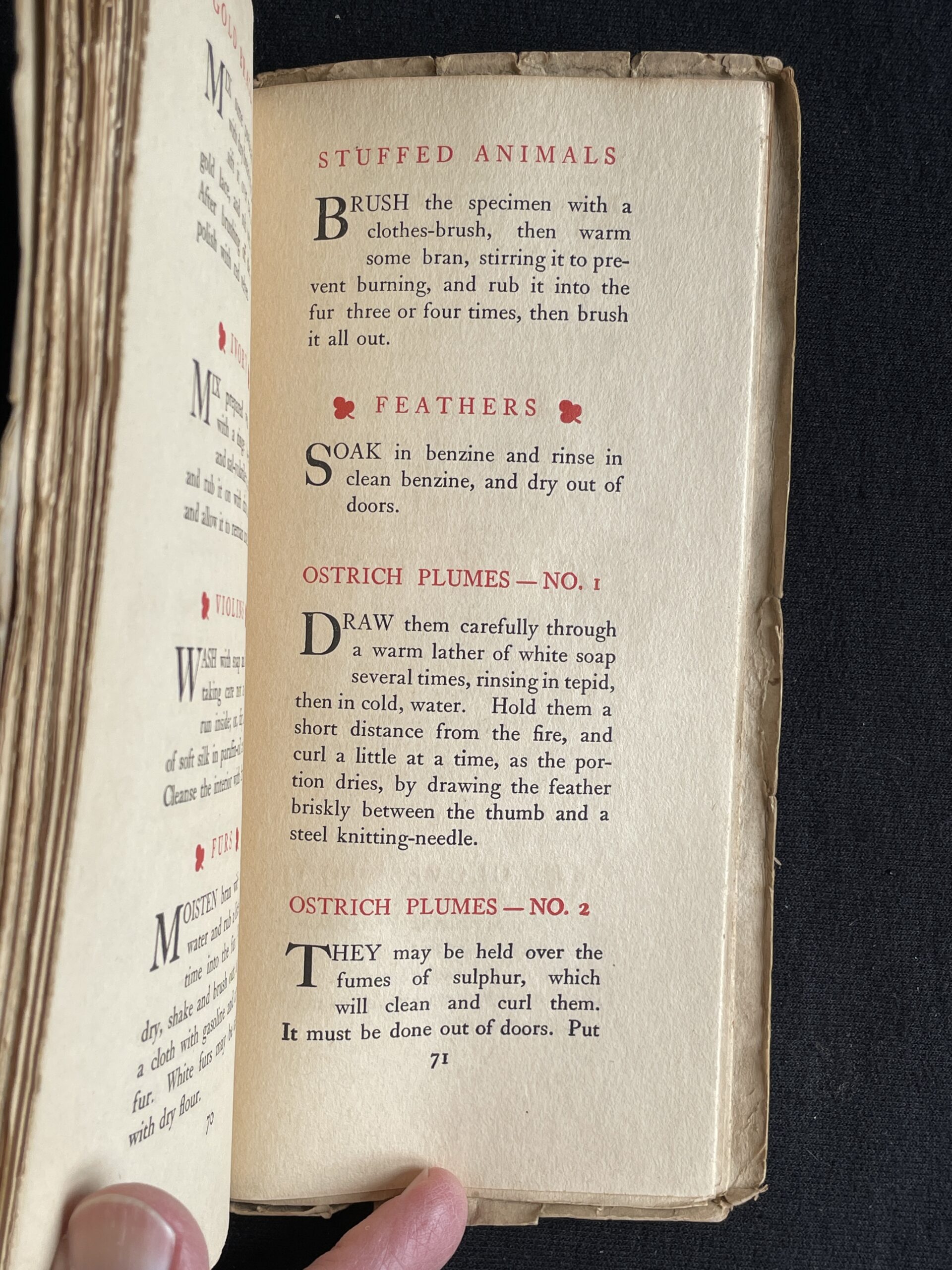
The book includes cures for all the stains you would expect: soot, grass, wine, blood, etc. However, Courvoisier assumes your cleaning closet contains many items no longer kept there today, including turpentine, gasoline, kerosene, benzine, muriatic acid, sulphuric acid, oxalic acid, hypochloride of lime, sal-volatile (ammonium carbonate in alcohol), powdered pipe-clay, and powdered whiting (chalk dust). She also assumes you’ll be needing to clean your stuffed animals (“brush the specimen with a clothes-brush, then warm some bran, stirring it to prevent burning, and rub it into the fur three or four times, then brush it all out”), ostrich plumes (“they may be held over fumes of sulphur, which will clean and curl them. It must be done out of doors”), and violins (“wash with soap and water, or dip a piece of soft silk in paraffin oil and rub. Cleanse the interior with dry rice).”
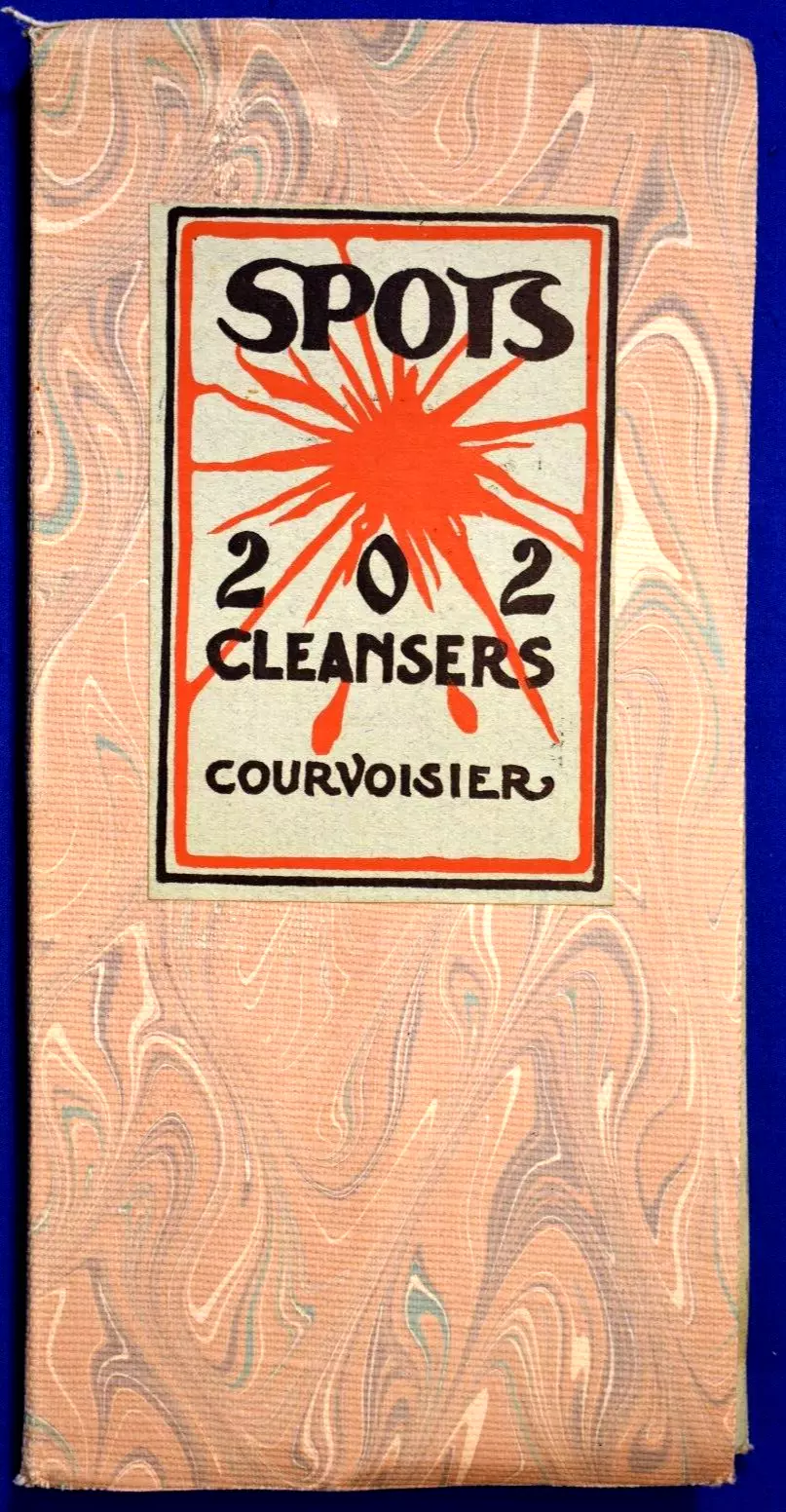
Alternate binding of Spots, with same artwork but marbled paper—or is it cloth? (eBay)
Perhaps unnecessarily for a book about cleansers—“a handy volume for the housewife,” says the 1911 Impressions Annual catalog—Spots was still given the usual Paul Elder treatment, with at least two bindings and at least three different cover states (see photos). The “Housewife Edition” was issued in paper wraps with a matching envelope, while the “Tomoye Edition” was bound in hand-finished, flexible suede calf for $2. (Who buys a book about cleaning products in hand-finished, flexible suede?) The smart money is on Spencer Wright as the cover design artist, given that he designed the covers for 101 Epicurean Thrills, but I have no confirmation of this.
Alternate cover of Spots, with different artwork (eBay)
Clarice Towne was born on 17 November 1872 in Petaluma, California, the sixth of seven children of Smith Darius Towne, a druggist, and Amanda Henrietta Munday. Both her parents came to Petaluma from Missouri in the 1850s and were reckoned two of the city’s pioneers. Clarice’s obituary notes that she was educated in Petaluma and “was one the of the members of the social set.”
Clarice married art dealer Ephraim Benoit Courvoisier in San Francisco on 3 September 1905. It was her first marriage, but his third; their daughter Alice was born in 1908. The marriage ended in divorce, and Clarice later remarried a man named Courtney. (Ephraim Courvoisier would go on to marry twice more, for a total of five wives.) Clarice died on 5 November 1930 in Los Angeles, and is buried in the Towne family plot in Petaluma.
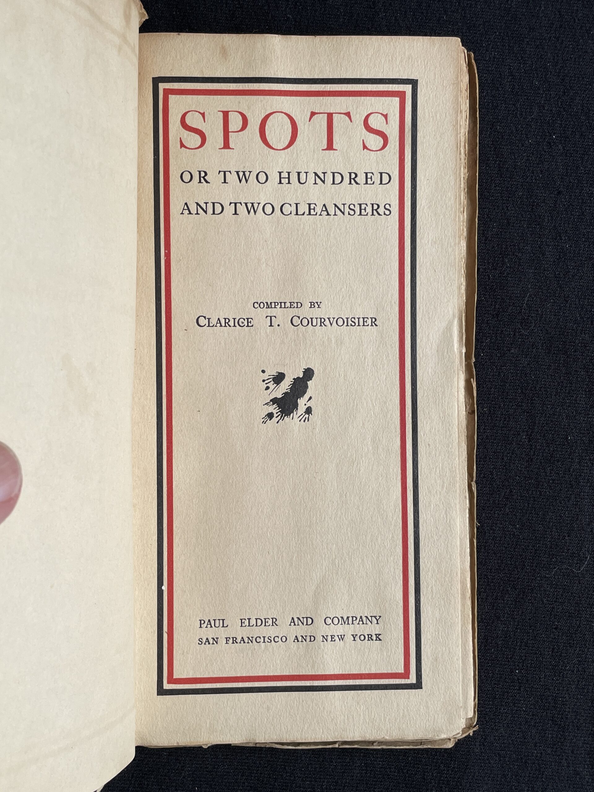
Title page of Spots (David Mostardi)Pages 18-19 of Spots (eBay)Pages 70 of Spots (David Mostardi)Page 71 of Spots (David Mostardi)
The American humorist Don Marquis, who wrote the archy and mehitabel stories, once said that “publishing a book of poetry is like dropping a rose petal down the Grand Canyon and waiting for the echo.” Paul Elder published many unremarkable volumes of poetry, and those authors would surely have smiled ruefully at Marquis’s quip.
In the case of Greville d’Arville’s Omega et Alpha, however, the echo was loud and clear: it was the reviews of the critics, and they were not kind. In the magazine The Land of Sunshine, one reviewer wrote: “Doubtless as bad poems have been written before as those in Grenville D’Arville’s Omega et Alpha, but they seldom get into book form. And a very pretty book the publishers have made of this assault upon grammar and poetic feeling. D. P. Elder & Morgan Shepard, San Francisco. $1.25.”1The Land of Sunshine, vol. 12, no. 1, December 1899, p58
Perhaps anticipating his awful reviews, Greville begins the book with a poem entitled “To My Critics”:
I fain would ask of thee,
As critics, true and brave,
If I a poet be;
And not a rhyming knave?
For if I fail in rhyme,
with mind intent on high,
The lofty heights to climb;
Forgive me then—I die.
And one of the final poems is “The Passing Century,” no doubt one of the examples submitted by the critics as evidence of the assault upon poetic feeling:
Out on the iron crane of time,
Swung by the smith with his mighty arm,
Swings the century, hoary with rime,
Moulden and shapen beneath its barm.
Swift as it moves to its graven place,
A shadow it case on the pregnant earth:
Darkly the dawn, of an age, we trace;
Dumb at the thought of its awful birth.
Greville d’Arville was the pen name of Grenville Stevens Pettis (29 Aug 1870, Vallejo CA–21 Dec 1935, Los Gatos CA), the son of John Edson Pettis (1840-1907) and Luella Priscilla Snow (1848-1924). Grenville married Emily Lucy Cohn (1870-1935) about 1929. He was a composer and specialist in Chinese music. Upon his death, he bequeathed musical instruments and books about Chinese Music to Mills College, a lyric drama “Adam and Eve” to the Metropolitan Opera of New York City, and many other compositions to the Library of Congress. He and Emily are buried at the Los Gatos Memorial Park in San Jose, California.
1
The Land of Sunshine, vol. 12, no. 1, December 1899, p58