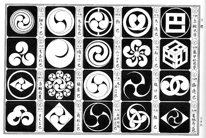
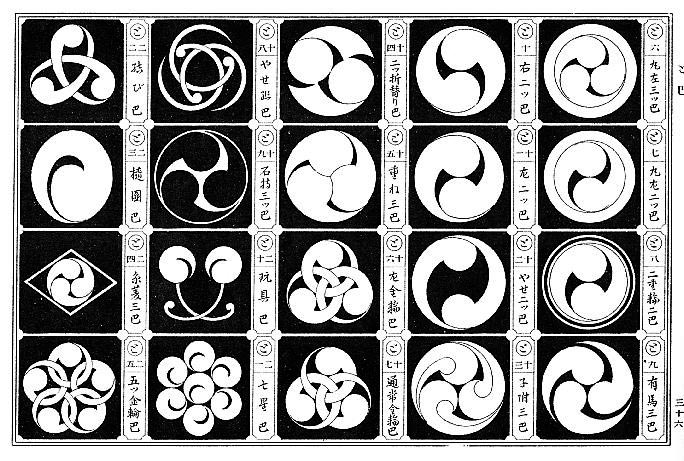
The Japanese word tomoe (巴) refers to a comma-shaped symbol. There are hundreds of traditional Japanese tomoe designs. The most common variant is the three-tomoe design called mitsudomoe (三つ巴), which, according to Japanese tradition, creates the harmony of a perfect circle. Here are some examples of tomoe, taken from the book Japanese Design Motifs, by Fumie Adachi, Dover, 1972.


The tomoe has been a favorite symbol in Japanese heraldry for centuries. Today, the mitsudomoe has become popular with corporations and taiko drum troupes.
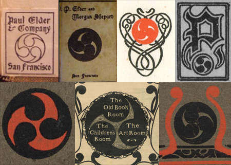
Elder first used the mitsudomoe design in 1900, which he anglicized as the word “tomoyé” (sometimes with the acute accent, sometimes without), and it became a logo of sorts for him. He used it in many books and magazines over the next two decades. When he hired John Henry Nash to run the new in-house printing shop in 1903, it was christened “The Tomoyé Press”.
Although it is unknown why Elder chose the tomoyé, he likely wanted to emphasize the connection between the Orient and his own book arts. Below are just a few of the many tomoyé marks Paul Elder used over his career.
