Wayfarers in Italy

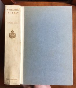
Cover of “Wayfarers in Italy” edition of 100

Katharine Hooker’s Wayfarers in Italy is perhaps the finest book issued by Elder & Shepard during their five-year partnership. It was printed in 1901 at the Stanley-Taylor Company on hand-made Ruisdael paper in two different limited editions of 100 and 300 copies. The The title page decorations and illuminated chapter headings were almost certainly designed by Morgan Shepard, and the book contains many photographs taken by Katharine’s daughter Marian. In 1902, Scribner’s bought publication rights the book from Elder; their edition of Wayfarers went through four printings by 1905.

It’s not clear how many copies of Wayfarers in Italy were offered for sale to the public. The colophons suggest that only the fancy 100-copy edition was offered for sale, but the 1902 Elder & Shepard holiday catalog reads “private edition of four hundred copies of which two hundred are for sale.” Even more confusing, my copy of the 300-copy edition has no binding, and appears never to have had one.

Hooker (1849-1935), born Katharine Mussey Putnam in Milwaukee, Wisconsin, grew up privileged and well-connected in turn-of-the-century California. She had an active, athletic youth, climbing Half Dome in Yosemite Valley and hiking the Grand Canyon: feats very rare for a woman in the 1860s. She learned French and German as a teenager, and had a lifelong interest in books.
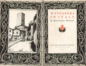
Title page and frontispiece of “Wayfarers in Italy”

In 1869, Katherine married John Daggett Hooker, who became wealthy in the ironworks industry. This allowed her to take an extended trip to Europe in 1896 with her daughter Marian and family friend Samuel Marshall Ilsley (author of By the Western Sea, Elder & Shepard’s first publication). She and Marian returned to Italy in 1899 (by which time Katherine had also become fluent in Italian), and it was this trip that became the basis for Wayfarers. The commission came to Elder & Shepard through Katharine’s sister Mary Putnam, who was married to Morgan Shepard. Katharine also wrote two other travel books about Italy, Byways in Southern Tuscany (Scribner’s, 1918) and Through the Heel of Italy (Rae D. Henkle Co., 1927).
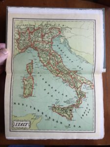
Map of Italy in 1901, included in the back of the book. The boundaries of several regions have changed since then, and the national border does not yet encompass South Tyrol or Trieste, areas that were annexed to Italy after World War I.

Hooker’s prose is enjoyable, and if she uses the passive voice a bit too often, I forgive her. She is adept at painting a gauzy, romantic picture of warm Italian summer afternoons, while also recounting amusing and interesting conversations with the locals. In Milan’s Museo Poldi-Pezzoli, Hooker and her daughter fail to find a certain Madonna and Child listed in their catalog; they quiz the custodian without success, but later he escorts them into a private room to show them the painting. In Ancona, she delightfully describes a heaping plate of light, fluffy fritto misto. In Venice, they strike up a friendship with their gondolier, Giovanni, who teaches them about the hardships and politics of his profession. Hooker’s visit to Siena can be dated to August 1899 because she witnessed the Palio on August 16th, where the contrada of Lupa was victorious. And if you are an experienced visitor to modern Italy, you will shake your head on almost every page as you think about how much has changed in the last 110 years.

Marian Osgood Hooker (1875-1968) also had a notable life. She became a physician and published numerous medical and scientific books, in addition to being a prominent amateur photographer. In 1903, Marian became the first woman to climb Mt. Whitney (the tallest mountain in the contiguous 48 states, named in honor of her great-uncle Josiah Whitney), in a party that included family friend and famed naturalist John Muir.
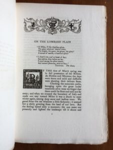
Page 3 of “Wayfarers in Italy”

Elder & Shepard’s edition of Wayfarers in Italy is rare because so few were printed, but the Scribner’s edition is easier to find. Here is one vintage book you will enjoy reading.

Pages 88-9 of “Wayfarers in Italy”
Pages 242-3 of “Wayfarers in Italy”
Pages 244-5 of “Wayfarers in Italy,” with one of Marian Hooker’s photographs
Page 279 of “Wayfarers in Italy”
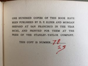
Colophon of the edition of 100 copies. The “E” was written by Paul Elder, the “S” by Morgan Shepard.
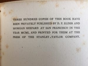
Colophon of the edition of 300 copies


Do any furnishings from Elder’s bookstores still exist?

Bernard Maybeck designed wooden furniture and medieval-style chandeliers for the 1906 store on Van Ness. These were moved to 239 Grant in 1909, and later to 239 Post in 1921. Maybeck also designed Gothic-inspired window screens for 239 Grant (you can see some of them at the top of the stairwell); those pieces were moved to 239 Post in 1921. Only one or two pieces were then moved to the modern Sutter & Stockton store in 1948.

The question is whether any of the furniture, chandeliers, or window screens have survived. Personally, I doubt it. I have not heard of anyone who claims to own them. Arts & Crafts was out of fashion in 1948, so it’s likely all those pieces were discarded. Of course, it’s possible some have survived but their owners no longer know their provenance.

Categories FAQ

Welcome to the new paulelder.org

Today I am launching the newly-redesigned paulelder.org. I have added several new features, including a blog, biographies of notable people and frequently asked questions. Please let me know what you think!

Categories FAQ

Do any of Elder’s bookstores still exist?

No. However, four buildings that once housed Elder’s stores still exist. Here are the details:

  • Mills Building, northeast corner of Bush & Montgomery, San Francisco. Elder’s shop was a room on the mezzanine. The building was burned out in the 1906 earthquake and fire, but the shell was saved and the interior rebuilt. The Mills Building still stands today.
  • 238 Post, San Francisco. Destroyed in the 1906 earthquake and fire. The structure built in its place, numbered 250 Post, became the longtime home of Gump’s, the famous luxury furnishings store. When Gump’s moved to 135 Post in 1995, a Zara store took its place. In 2019, Gump’s returned to 250 Post, occupying just the right side of the building; Zara remains in the center and left sections.
  • 22 Chapala, Santa Barbara. Demolished.
  • 1203 State at Anapamu, Santa Barbara. Uncertain, but probably not any of the existing buildings at this location.
  • Bush & Van Ness, San Francisco. Elder vacated in April 1909. In May 1910, the building was converted into the clubrooms of the Professional Chauffeurs’ Association of San Francisco; new furnishings included a piano, pool tables, a circulating library and a stock of cigars and soft drinks.  In January 1912, it was the showroom for R. B. Daggett & Co., distributors of the Baker Electric automobile. But by January 1914, the beautiful Maybeck building, just eight years old, had been demolished, and the current five-story brick hotel, designed by Nathaniel Blaisdell, was under construction. As of May 2025, the current tenant is the Calista Organic Hotel.
  • 43-45 East 19th St, 4th floor, New York City. The building has been converted to residential apartments, with a restaurant on the street level.
  • 239 Grant, San Francisco. Built in 1909 as an identical twin to the building at 231 Grant, a sixth story was added in the 1950s, and the original distinctive cladding was removed. The building still stands at the corner of Grant and Tillman Place; the street level sales areas have been remodeled many times.
  • Booth at the Panama-Pacific International Exposition. Demolished when the Fair closed in November 1915.
  • 239 Post, San Francisco. Now numbered 237 Post, the building is currently a Graff Diamonds store.
  • Sutter & Stockon, San Francisco. Demolished circa 1969. Now the site of the Grand Hyatt Hotel.
  • Mills Building. Paul Jr. opened a small satellite shop at 228 Montgomery Street in order to serve the downtown business community. This retail space still exists today, to the left of the main entrance.

What is a tomoyé?

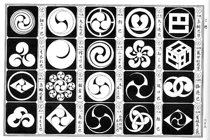
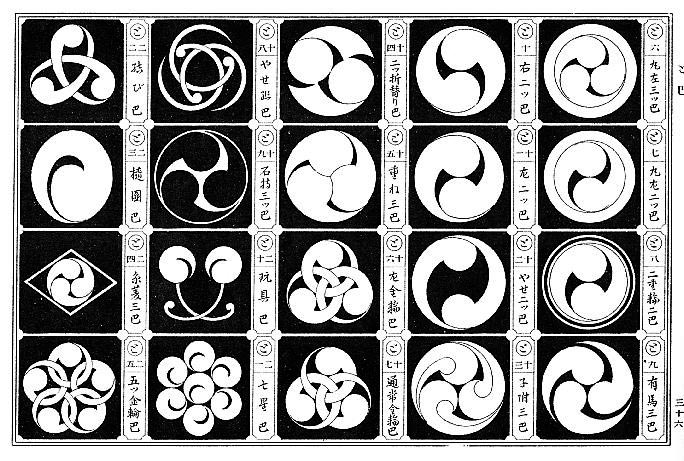
The Japanese word tomoe () refers to a comma-shaped symbol. There are hundreds of traditional Japanese tomoe designs. The most common variant is the three-tomoe design called mitsudomoe (三つ巴), which, according to Japanese tradition, creates the harmony of a perfect circle. Here are some examples of tomoe, taken from the book Japanese Design Motifs, by Fumie Adachi, Dover, 1972.

Examples of tomoe
Examples of tomoe
More examples
More examples

The tomoe has been a favorite symbol in Japanese heraldry for centuries. Today, the mitsudomoe has become popular with corporations and taiko drum troupes.

Elder first used the mitsudomoe design in 1900, which he anglicized as the word “tomoyé” (sometimes with the acute accent, sometimes without), and it became a logo of sorts for him. He used it in many books and magazines over the next two decades. When he hired John Henry Nash to run the new in-house printing shop in 1903, it was christened “The Tomoyé Press”.

Although it is unknown why Elder chose the tomoyé, he likely wanted to emphasize the connection between the Orient and his own book arts. Below are just a few of the many tomoyé marks Paul Elder used over his career.

Some of Elder's many tomoye marks
Some of Elder’s many tomoye marks
Categories FAQ