Fairy Tales Up-to-Now

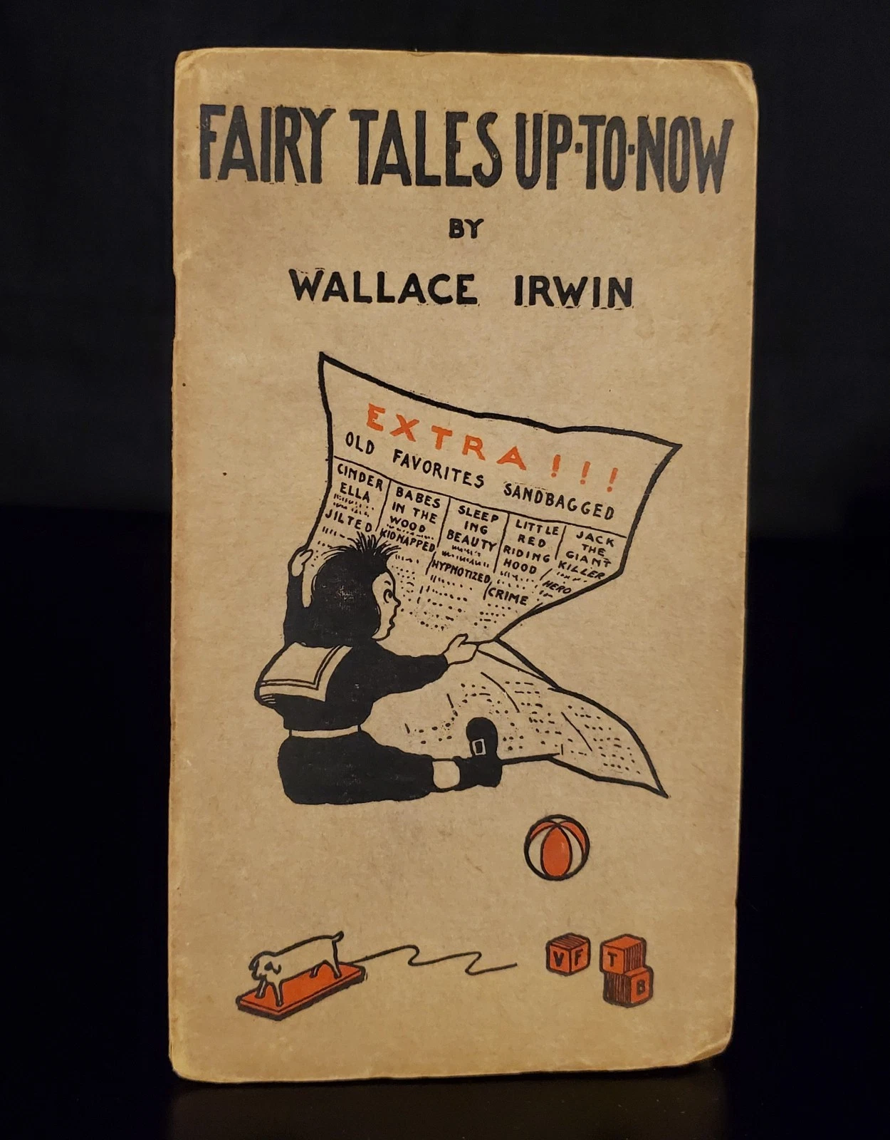
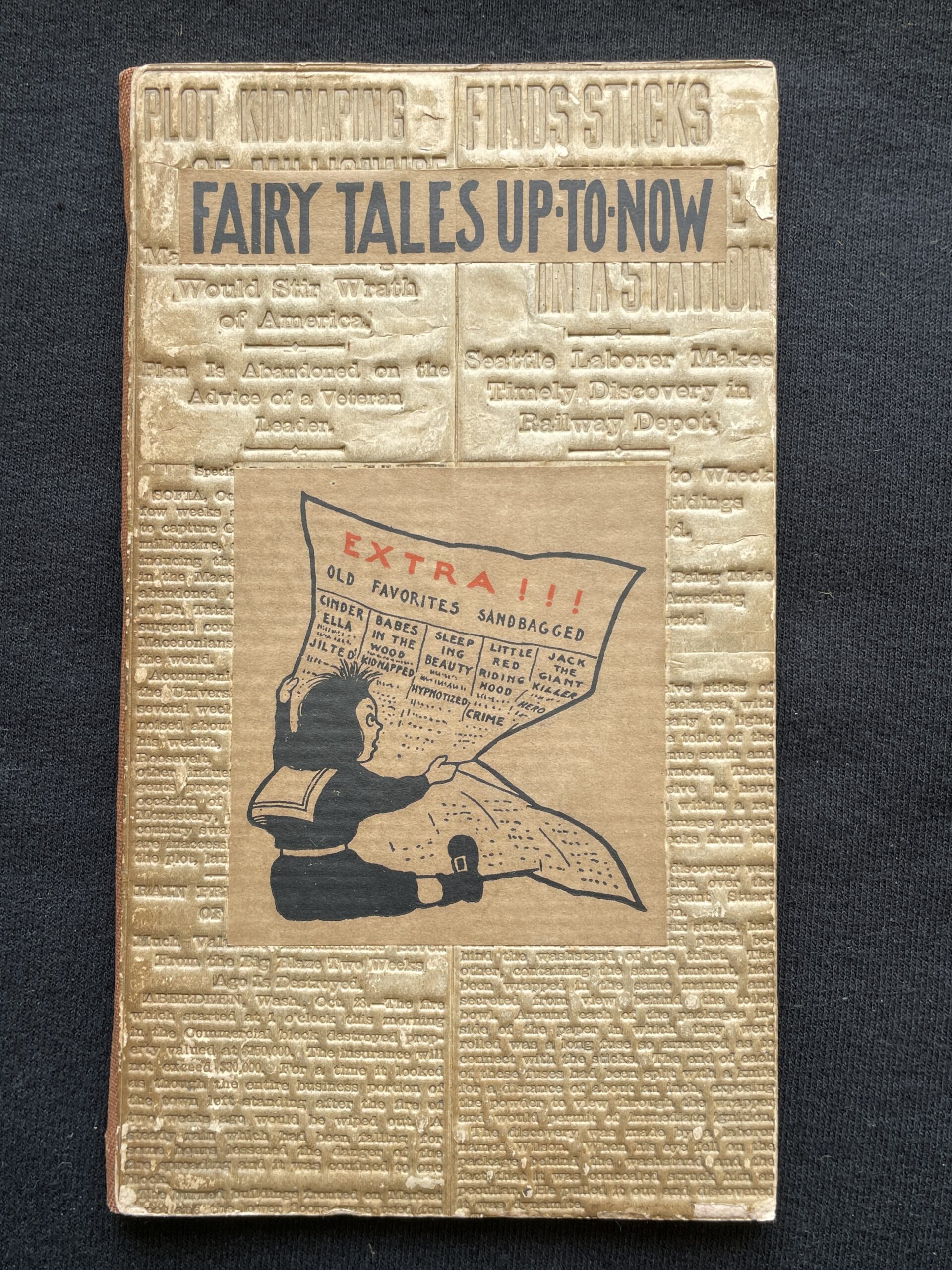
Cover of Fairy Tales Up-to-Now, a flong from the San Francisco Call of 29 October 1903, page 2.

Extra, extra, read all about it! Wallace Irwin rewrites old fairy tales!

In contrast to Irwin’s Love Sonnets of a Hoodlum, whose humor is obscure to modern readers, his 1904 Fairy Tales Up-to-Now is fairly accessible. The book contains five poetical satires of five classic children’s stories titled with tabloid newspaper headlines. Cinderella, a stenographer working for 50¢ a day, goes to the ball in a rented gown, but when the Prince discovers that her diamond slippers are just paste, he rejects her because he’s broke and needs a bride who’s wealthy. Cinderella, though, becomes a millionaire by selling faux-diamond slippers. Jack, of Beanstalk fame, rides off to slay the Standard Oil Giant, but is given a job instead, rises to the rank of treasurer and becomes a Giant himself, but then returns home to endow a library, gas-works and church. 

A charming feature of the book are the front and back covers, which are flongs, temporary paper molds used for printing newspapers. Stereotype metal was poured over the flong, then the stereotype was wrapped around the press’s cylinder for printing. After a few thousand copies, the stereotype metal would begin to wear out: at this point it would be melted down, then poured again over the same flong to make a new sharp copy for printing. Once the day’s press run was finished, the flongs were normally discarded, but here they were sent to Elder to be chopped up into covers. Each individual copy of  Fairy Tales Up-to-Now is therefore unique.
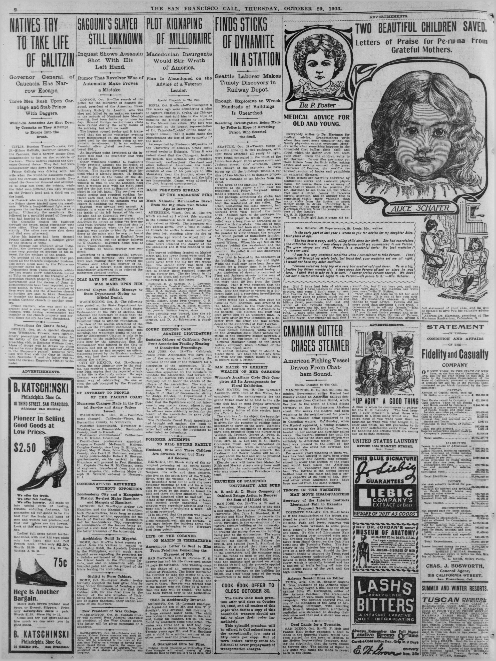
The San Francisco Call, 29 October 1903, page 2. This is the page printed from the above flong (tops of columns 3-4).

With a newspaper index service, it is possible to find the exact page a given flong was used to print. The example on this page is from the San Francisco Call of 29 October 1903, page 2. The flong would originally have been the size of the entire newspaper page, but just the tops of columns 3 and 4 are used as the book cover. Presumably, other copies of Fairy Tales Up-to-Now exist somewhere bound with other sections of this page 2 flong.

The rear cover of Fairy Tales Up-to-Now is also a flong, but there was no attempt to match up flongs from the same page or date. Our example copy’s back cover is from 4 October 1903, molded three weeks before the flong used on the front cover.

Fairy Tales Up-to-Now was also issued in paper wraps instead of flongs (see photo below), presumably cheaper but far less whimsical.

As of the date below, I have examined twelve copies of the flong-binding version of Fairy Tales Up-to-Now, and have been able to identify the specific newspaper page printed by all of them. Nine flongs are from the San Francisco Call in late 1903: most from mid-October, plus one from December 27th. A second group of three flongs are from the San Francisco Examiner in early April 1904. To me, this implies a second printing in March 1904, or perhaps even a third printing if we assign the December 27 flong to a second printing. It would also indicate that Fairy Tales Up-to-Now was a big seller for Paul Elder. 

Do you own a copy of Fairy Tales Up-to-Now? If you would send me photographs of the front and back cover, I would be grateful. I am surveying images so that I can get a better idea of when the printings occurred. You can reach me at paulelder@pobox.com. Thank you very much in advance!

Thanks to Molly Schwartzburg and Andre Chaves for information about flongs.

Updated 2026-07-27
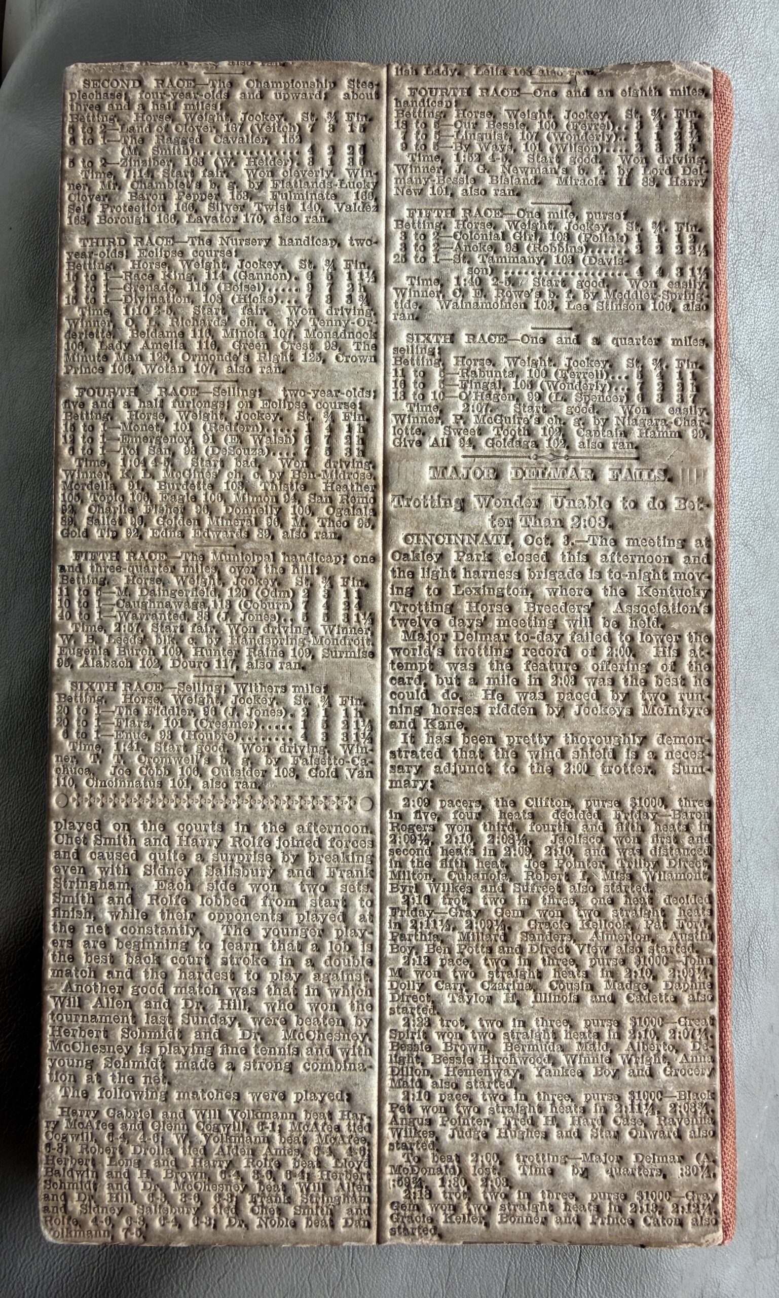
The back cover of the same copy of Fairy Tales Up-to-Now. This flong was used to print the Call of 4 October 1903, page 35, columns 3 and 4.
Alternate paper binding of Fairy Tales Up-to-Now. But why would you buy this one when you could have a flong?
Fairy Tales Up To Now title
Title page of Fairy Tales Up-To-Now
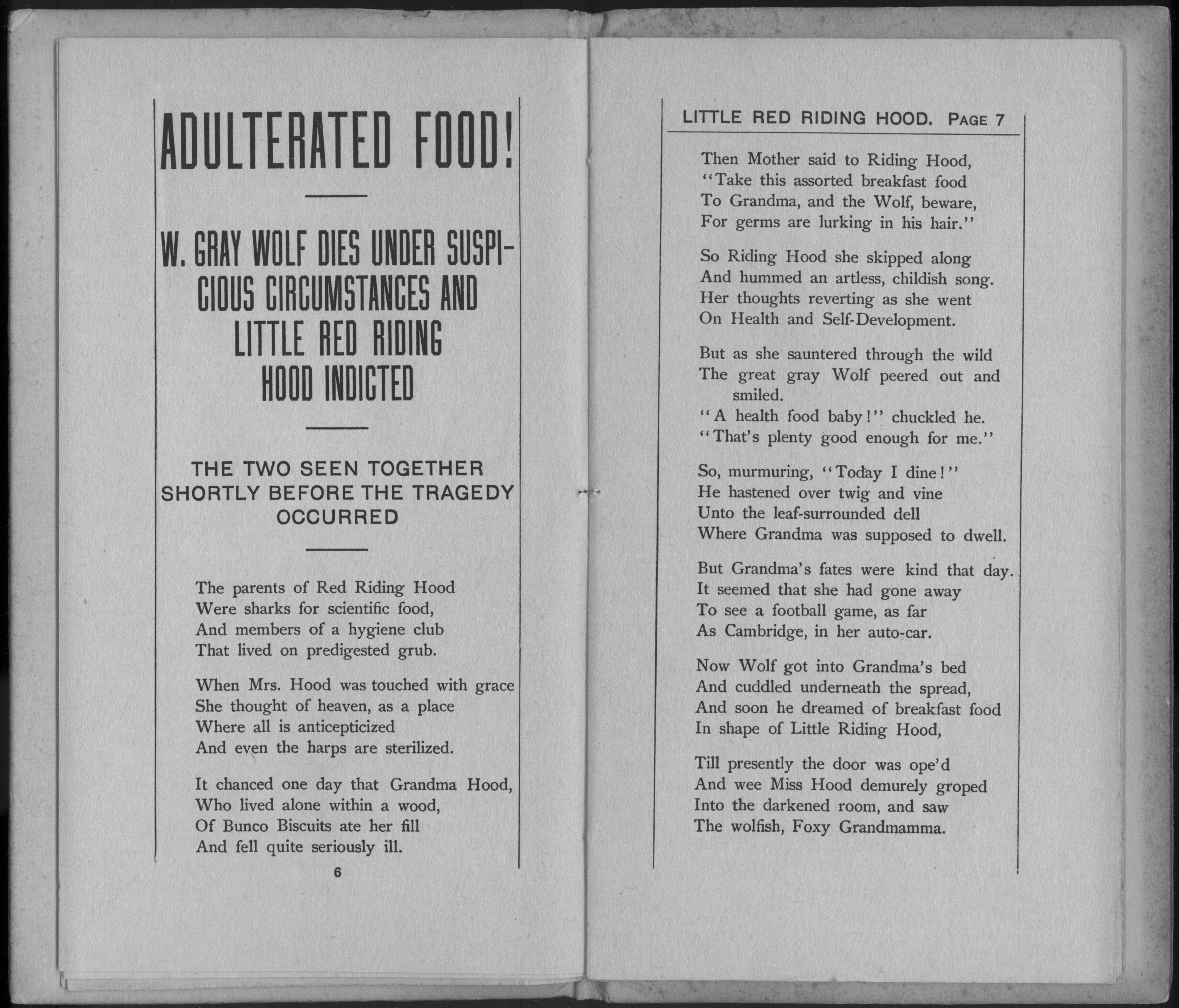
Fairy Tales Up To Now p06
pages 6-7 of Fairy Tales Up-To-Now
Fairy Tales Up To Now p10
pages 10-11 of Fairy Tales Up-To-Now

Colophons

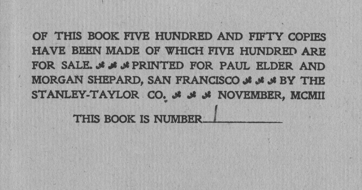
Standard Upheld colophon small
Colophon of “The Standard Upheld,” by Morgan Shepard, 1902. Copy #1 of 500.

In publishing, a colophon is a brief description of a book’s production or publication details. The Latin word colophon comes from the Greek κολοφων meaning “summit,” or “finishing.” The term originally applied to inscriptions appended to the end of ancient Near East texts written on clay tablets. The colophon would contain such facts as the scribe, the owner, the literary contents and occasionally the reason for writing. For example, the Masoretic text of the Hebrew Bible contains colophons at the end of every book, noting, among other things, how many verses the book contains.

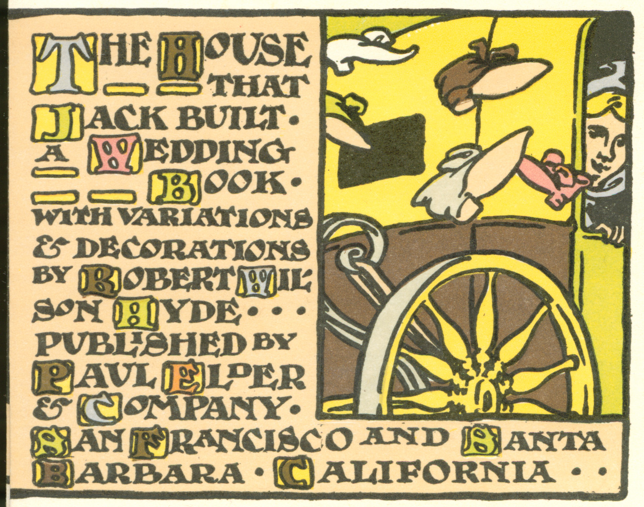
House That Jack Built colophon
Unusual hand-drawn colophon from “The House That Jack Built,” by Robert Wilson Hyde, 1904

Most Paul Elder publications after 1902 contain a colophon. By about 1906, the usual formula was: title, author, printer, month and date of publication. Most colophons were written out in full sentences, stylistically matching the tone and content of the book. From a research standpoint, the colophons are useful in pinning down when Elder’s printers (Nash, Swart, Funke, and Orozco) joined, then later left, the Tomoye Press. Colophons will also sometimes mention artists not otherwise mentioned on the title page.

As the purpose of the colophons was to impress the adults, Elder’s children’s books do not have them. Colophons are also typically missing from books which have significant end-matter, such as indexes or appendices.

Elder’s style, which mimicked that of other fine press books of the time, was to put the copyright information on the title page verso, and the colophon on its own page following the last page of text. In modern American books, the colophon has been subsumed into the copyright details, typically placed on the title page verso. European books often place the copyright/colophon at the end of the book.

Updated 2026-02-06

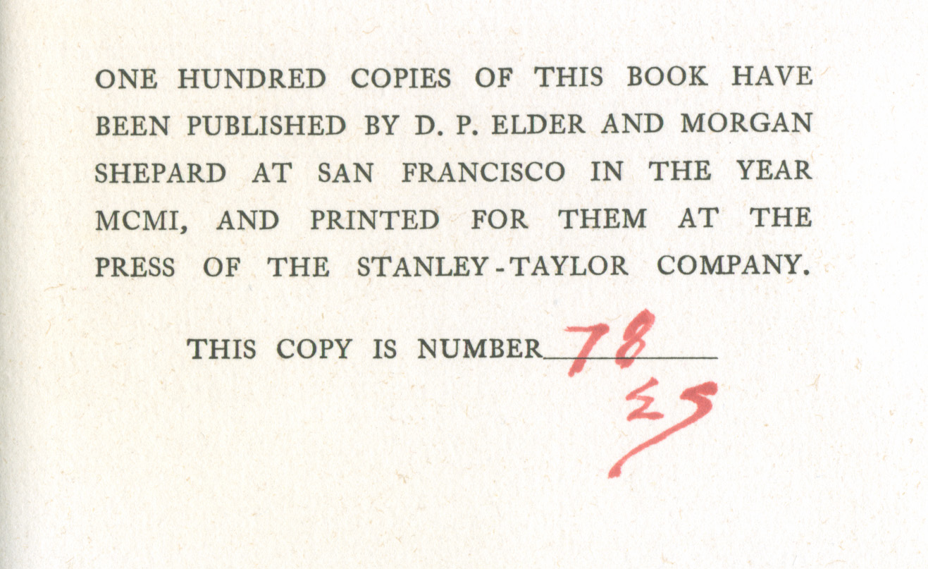
Wayfarers in Italy colophon
The earliest Elder colophon I have found so far, “Wayfarers in Italy,” by Katherine Hooker. The colophon is dated 1901, but the book’s title page reads 1902. Paul Elder has signed with the red “E”, Morgan Shepard with the red “S”
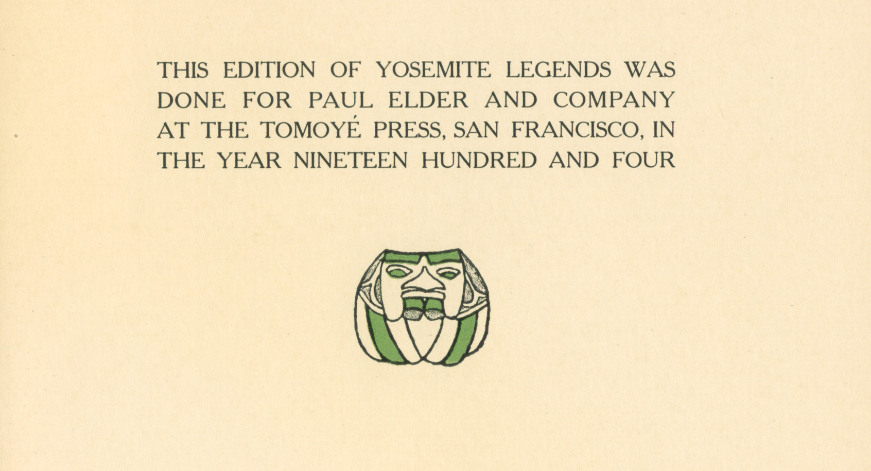
Yosemite Legends colophon
Colophon from “Yosemite Legends,” by Bertha Smith, 1904
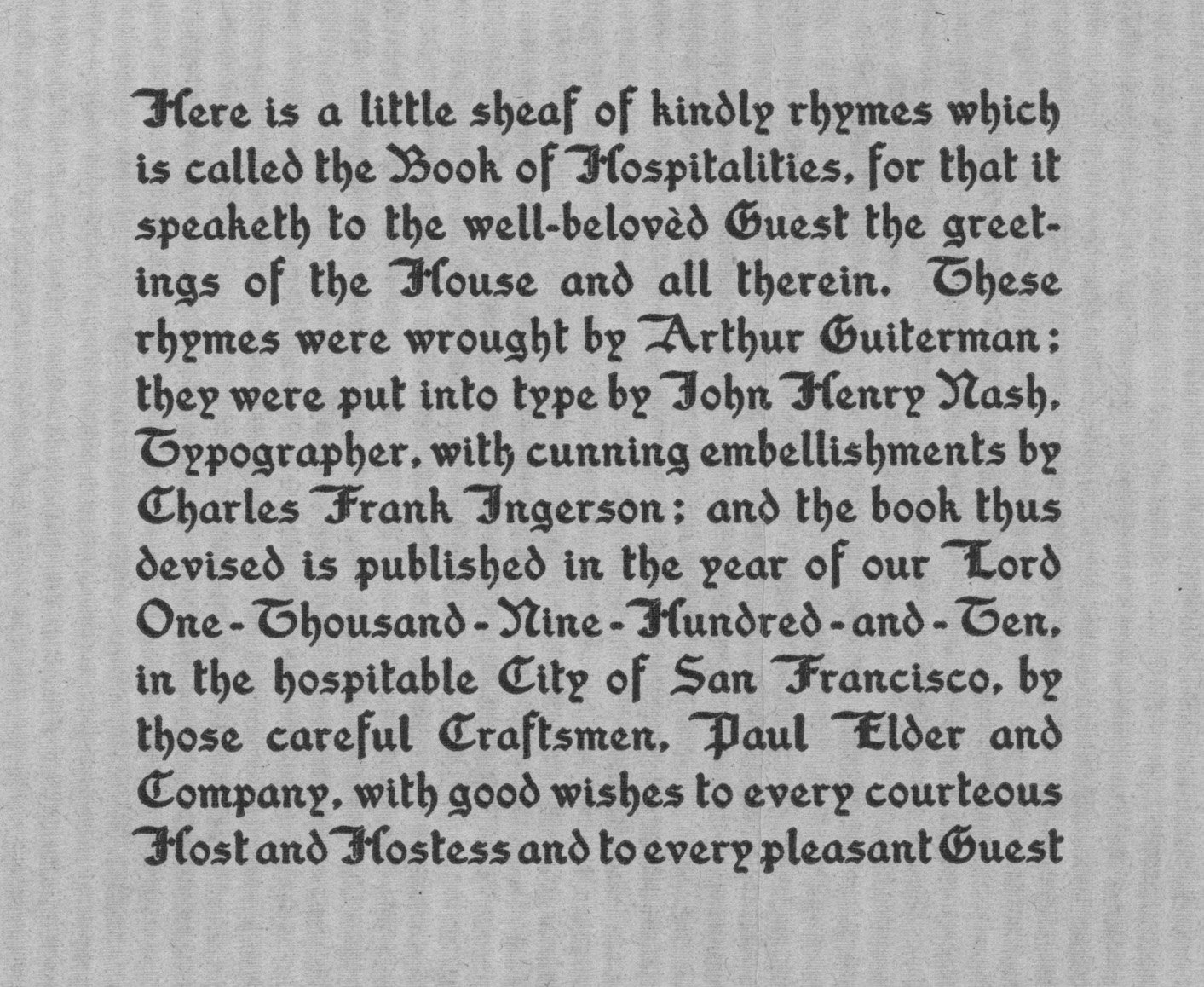
Book of Hospitalities colophon
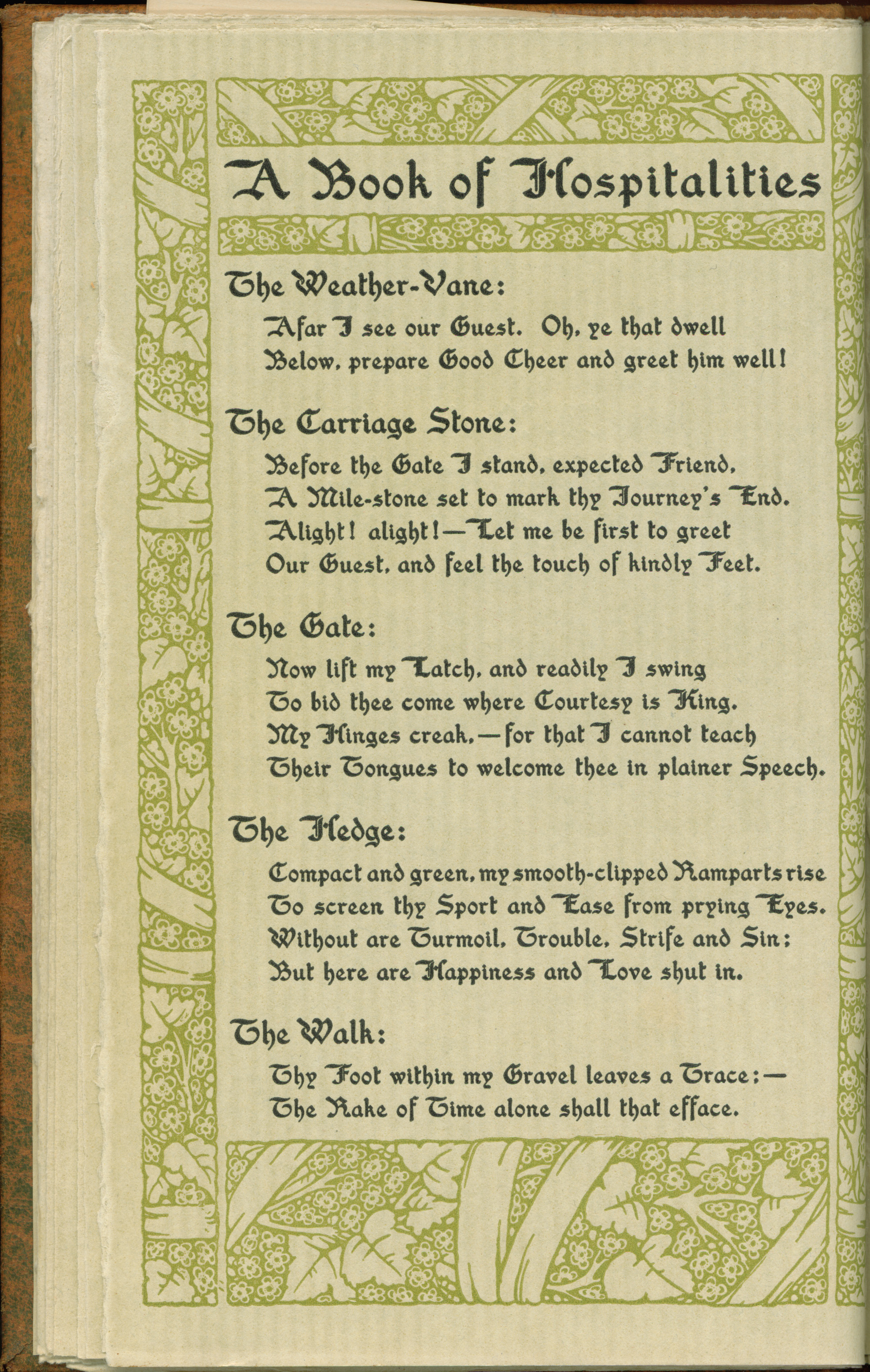
Colophon from “A Book of Hospitalities and Record of Guests,” by Arthur Guiterman, 1910
Charity colophon small
Colophon from “Charity,” verses selected by Beulah Warner, 1911
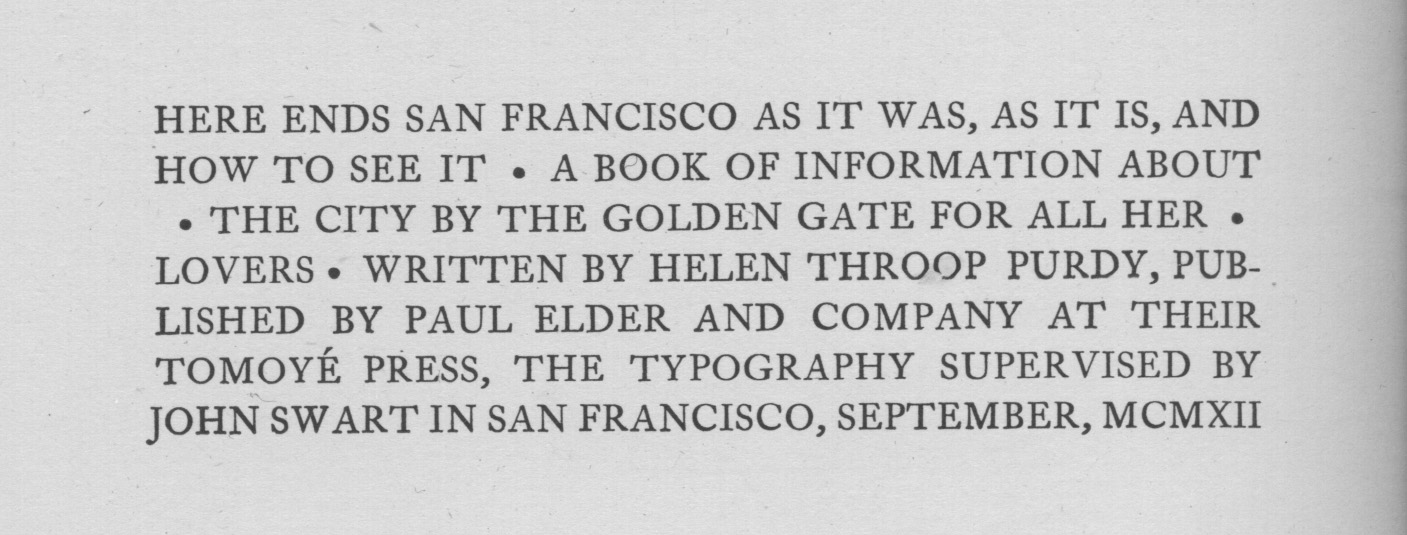
San Francisco Purdy colophon
Colophon from “San Francisco, As It Was, As It Is, and How To See It,” by Helen Throop Purdy, 1912
Erics Book of Beasts colophon
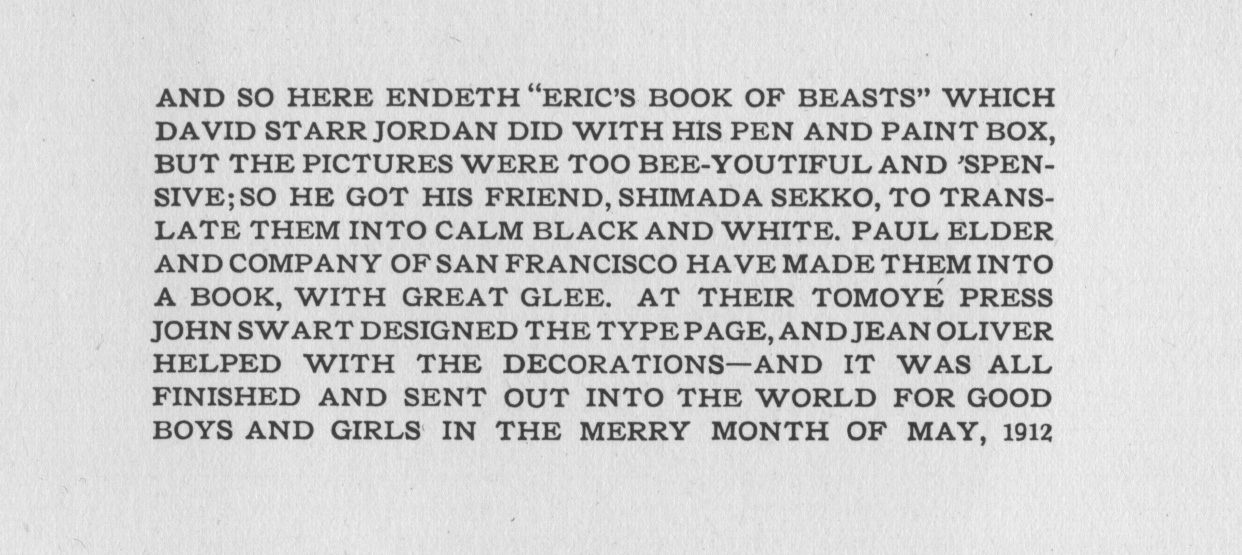
Colophon from “Eric’s Book of Beasts,” by David Starr Jordan, 1912
Categories FAQ

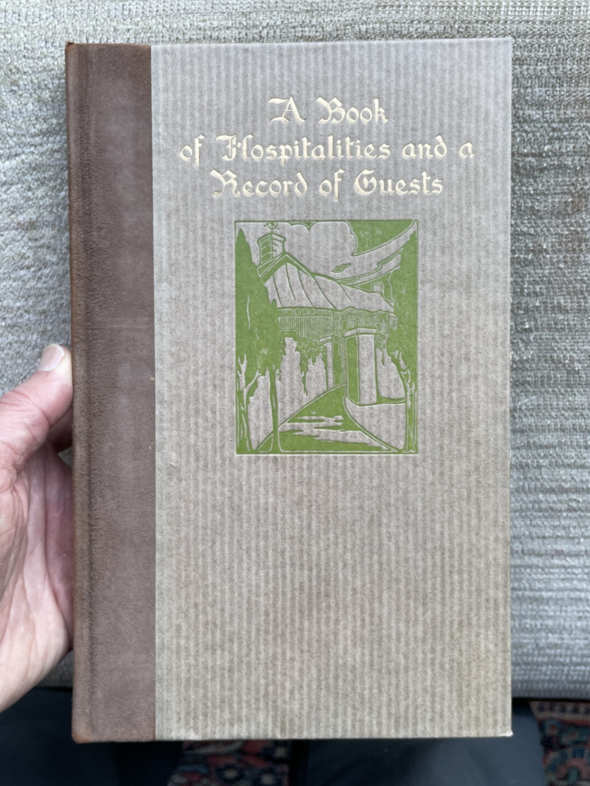
A Book of Hospitalities and a Record of Guests

Cover of A Book of Hospitalities, paper on boards

Guest books aren’t seen much today except at weddings and funerals. It seems they were more popular in the early 1900s, as Paul Elder published four guest books between 1904 and 1910.

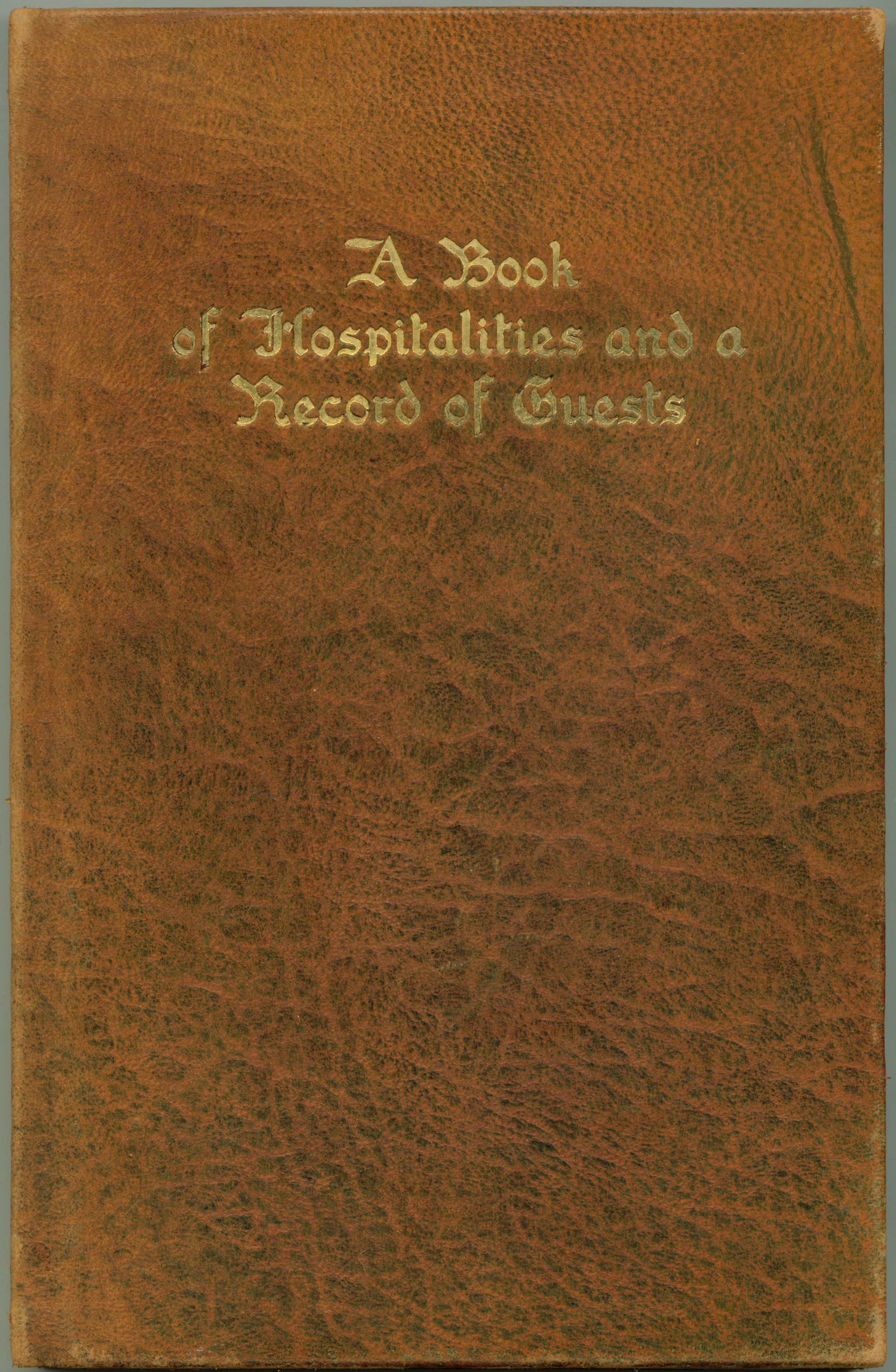
Arthur Guiterman’s Book of Hospitalities And a Record of Guests (1910) was probably intended to be placed in the guest bedroom. The first section (“A Book of Hospitalities”) contains a selection of sayings and epigrams for the house, and the second half (“A Record of Guests”) contains blank areas for the guests to write in. Guiterman was also involved in two other Elder publications: the magnificent 1908 Guest Book with artwork by Robert Wilson Hyde, and the 1907 humor book Betel Nuts, Or What They Say In Hindustan.

Arthur Guiterman (1871-1943) was born in Vienna to American parents and graduated from the College of the City of New York in 1891. He was the author of a dozen books, primarily poetry. He was also editor of Women’s Home Companion and Literary Digest. In 1910, he co-founded the Poetry Society of America (which still exists and celebrated its centennial in 2010), and served as president in 1925.

Book of Hospitalities cover
Cover of A Book of Hospitalities, leather on boards

I am particularly fond of Guiterman’s poem entitled “On the Vanity of Earthly Greatness”

The tusks which clashed in mighty brawls
Of mastodons, are billiard balls.
The sword of Charlemagne the Just
Is ferric oxide, known as rust.
The grizzly bear, whose potent hug,
Was feared by all, is now a rug.
Great Caesar’s bust is on the shelf,
And I don’t feel so well myself.

Book of Hospitalities title
Title page of A Book of Hospitalities

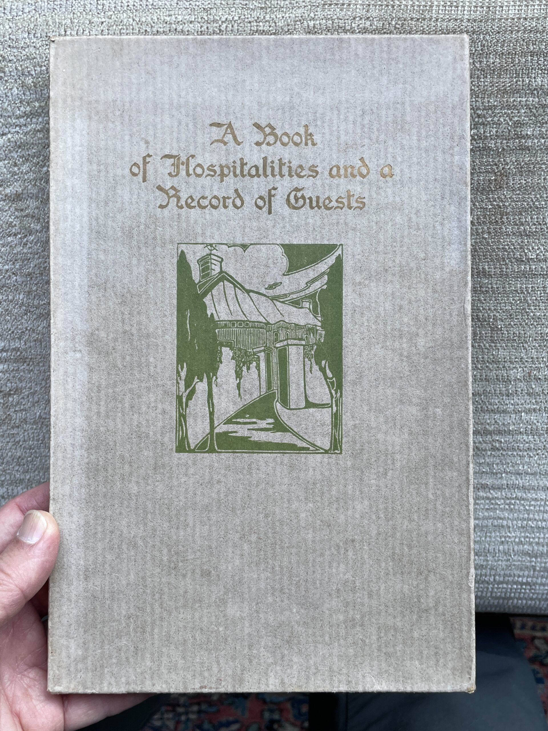
A Book of Hospitalities was published in two bindings: paper on boards, and leather on boards, both with a presentation box. If you happen to own a copy of my 2004 Checklist of the Publications of Paul Elder, 2nd edition, you will see that the page borders are taken from Book of Hospitalities.

Updated 2026-01-19

A Book of Hospitalities, presentation box
Book of Hospitalities frontispiece
Frontispiece of A Book of Hospitalities
Book of Hospitalities foreword
Foreword of A Book of Hospitalities


Book of Hospitalities main text
Text of A Book of Hospitalities


Arthur Guiterman
Arthur Guiterman (1871-1943)


Love Sonnets of a Hoodlum

Love Sonnets Hoodlum cover
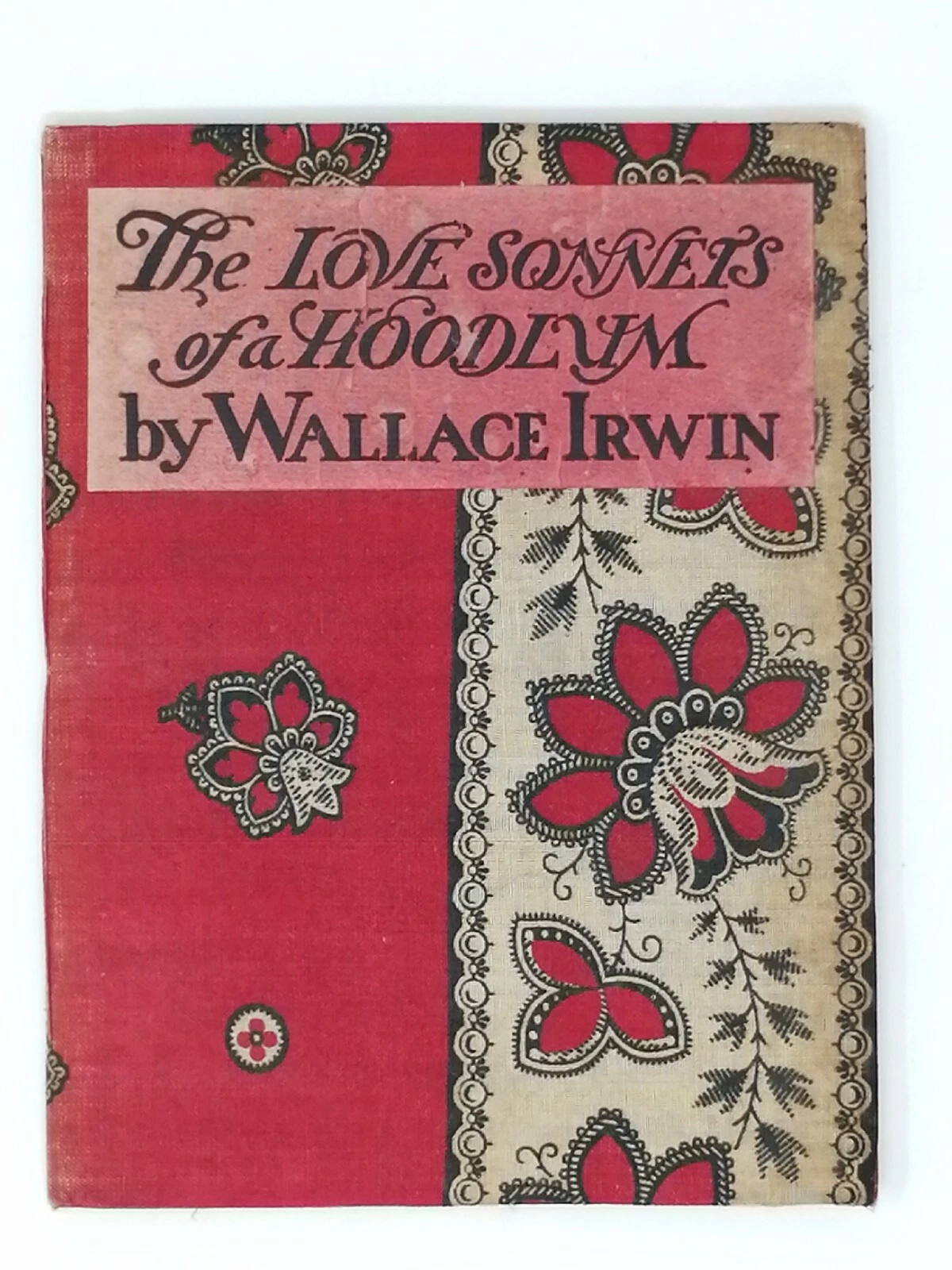
Rear (L) and front covers of Love Sonnets of a Hoodlum, in red paper wraps

Question: of the 400+ books that Paul Elder published, which one sold the most copies?

The surprising answer is Wallace Irwin’s Love Sonnets of a Hoodlum. First published in 1901, this slim volume of jaunty verse remained in print at least through 1907. Fellow San Francisco humorist Gelett Burgess (of “Purple Cow” fame) added a mock scholarly introduction. The reviews were lukewarm, particularly of Burgess’s introduction, but sales were like nothing Elder had ever seen. Between November 1901 and March 1902 alone, The Love Sonnets of a Hoodlum sold 12,000 copies.1San Francisco Chronicle, February 23, 1902, p4

Love Sonnets Hoodlum title
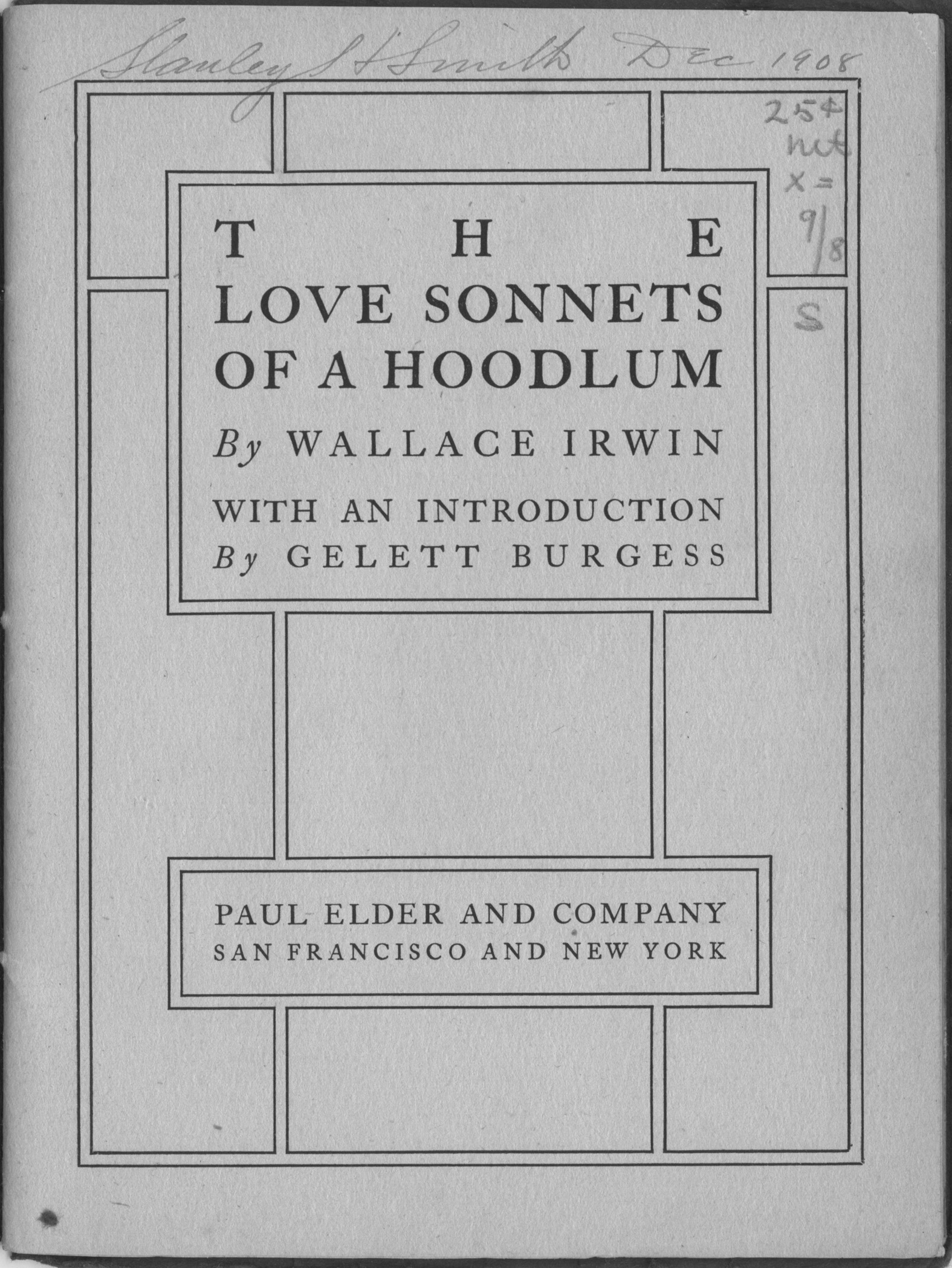
Title page of Love Sonnets of a Hoodlum

Wallace Irwin (1875-1959) was a well-known humorist in the early 1900s. Born in Oneida, New York and raised in Colorado, Irwin attended Stanford University where he edited two humor magazines, but was expelled for writing satirical poetry about the faculty. Afterwards, Irwin wrote for the Overland Monthly and San Francisco Examiner, and hung out with the local bohemian crowd. (Getting kicked out of a university seems to have been a requirement for local humorists: in 1894, Gelett Burgess was fired by UC Berkeley after pulling down a statue of pro-temperance campaigner Henry Cogswell. Burgess clearly saw a kindred soul in Irwin.)

For a book that sold so well, its creation was almost an accident. In his memoir, Irwin wrote that Burgess was looking through Irwin’s papers one day and noticed a slang sonnet written some years before. Burgess said, “It would be fun to make that part of a classic sonnet cycle, such as Petrarch wrote.”2Wallace Irwin, “I Look at Me,” typed manuscript, 132–33. Wallace Irwin papers, Bancroft Library, University of California, Berkeley. Irwin continued:

Love Sonnets of Hoodlum in fabric wraps

[The sonnets] rippled off the typewriter with no intention of being more than a literary prank. Burgess was generous enough to write the introduction, a mockpedantic essay in highly styled English. My neighbor Morgan Shepard and his partner Paul Elder recklessly offered to publish it as a sort of a gay pamphlet with a sale price of 25 cents. Its lacquer red paper cover featured the gentle cynicism “Showing how Vanity is still on deck / And humble Virtue gets it in the neck.” The bargain price contributed to its popularity, no doubt. A stingy first edition leaped toward more and larger editions so that the callow author was struck dumb by the prodigy. Reviewers were praising it all over the country. . . . And the sales went up to 130,000.

Autograph edition of Love Sonnets of a Hoodlum

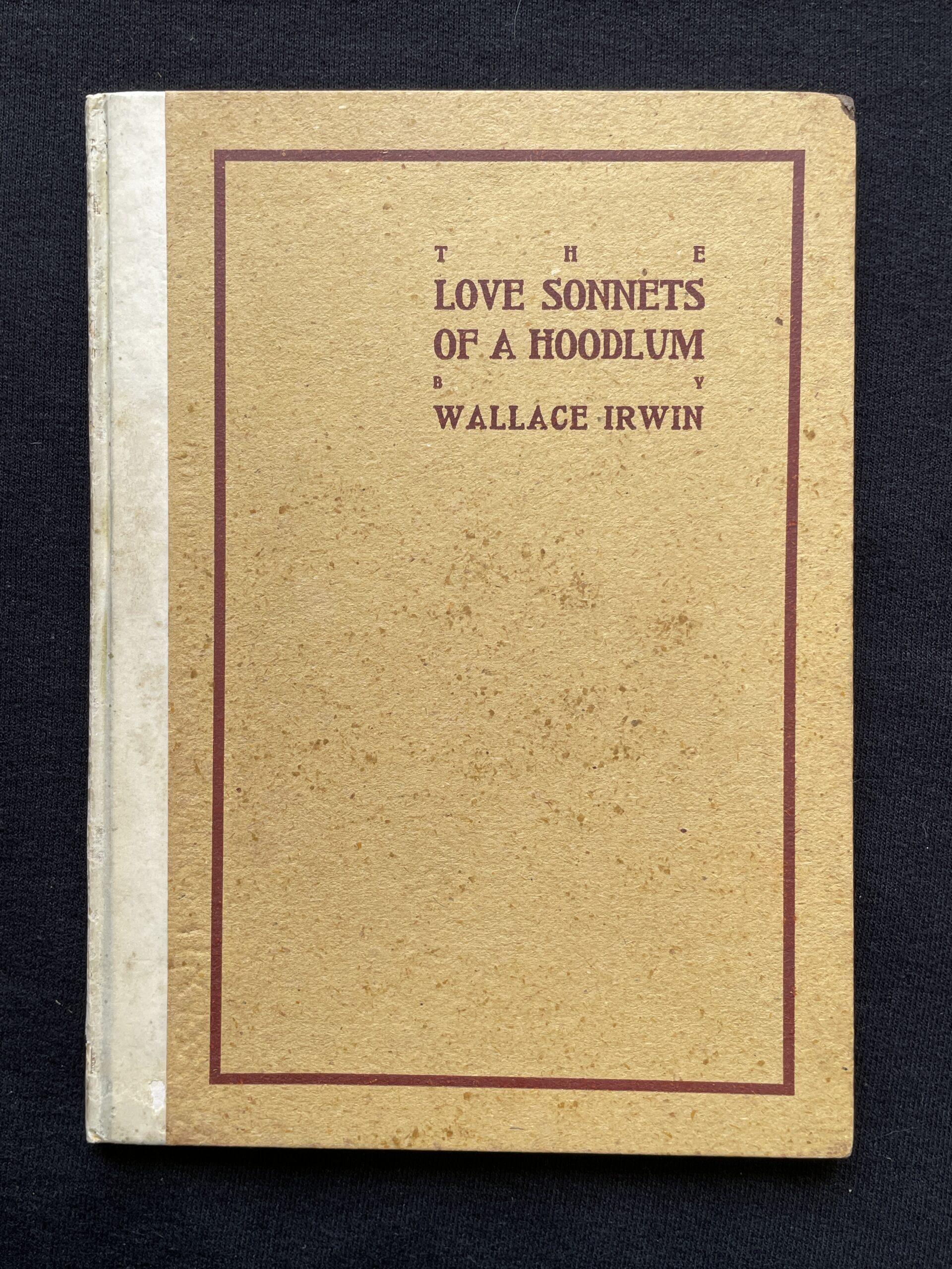
The Love Sonnets of a Hoodlum appeared in both red paper wraps and colorful fabric wraps. Ten fabric-covered examples have been seen so far, all different, and all (with one exception) made with bright white-and-red fabrics similar to the one shown on this page. There was also an autograph edition of 100 copies, in paper over boards.

Irwin’s humor has not aged well. In Love Sonnets of a Hoodlum, our hoodlum hero fancies a lady and attempts to win her favor, but neither Irwin’s slang nor his references will be familiar to today’s readers.

Most disturbing to modern sensibilities, however, is Irwin’s racial humor. In Sonnet II below, he caricatures both Italians (“Dago”) and Jews (“Cohenstein”). More was to come: in 1907 Irwin began a long serial for Colliers magazine purporting to be the letters of a 35-year-old Japanese “boy,” going so far as to call the fourth volume Yellow Peril, and posing for the cover photograph himself in yellow makeup.

Irwin wrote many other works, including the 1935 novel The Julius Caesar Murder Case, which is generally credited as the first mystery novel set in antiquity.

Updated 2026-01-19

Love Sonnets Hoodlum prologue
Prologue to Love Sonnets of a Hoodlum
Love Sonnets Hoodlum i
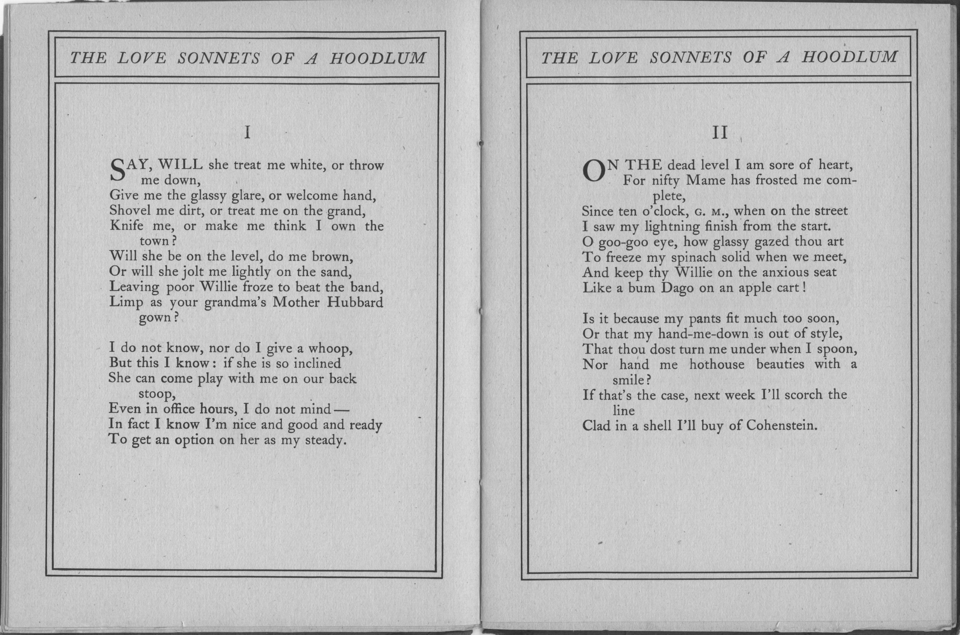
Sonnets I and II
Love Sonnets Hoodlum xxi
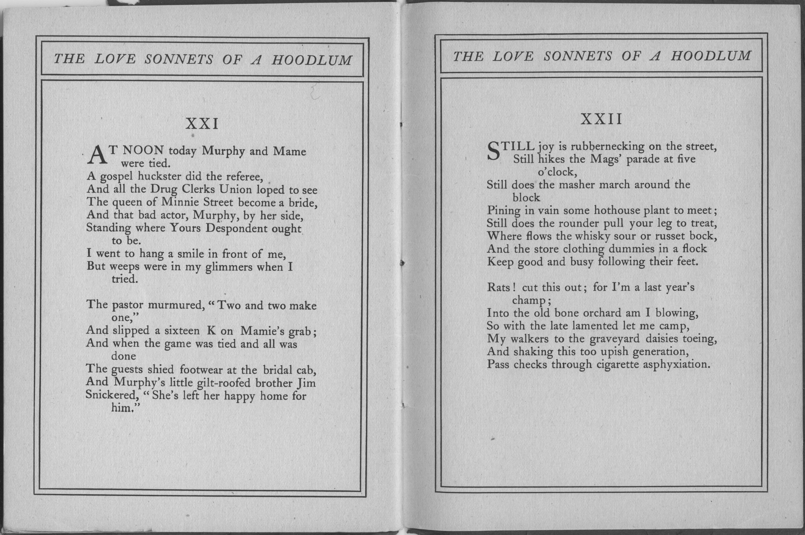
Sonnets XXI and XXII


  • 1
    San Francisco Chronicle, February 23, 1902, p4 ↩︎
  • 2
    Wallace Irwin, “I Look at Me,” typed manuscript, 132–33. Wallace Irwin papers, Bancroft Library, University of California, Berkeley. ↩︎

Paul Elder Bookseller Stamps

The eight known Paul Elder bookseller stamps

Pick up a book that was sold at Paul Elder’s bookshop, and open to the inside back cover. Sometimes, in the lower-left corner, you will find a pasted-in bookseller stamp. About the size and shape of a postage stamp and moistened in the same manner, they were affixed to all books sold in the shop, not just Elder’s own publications. The practice seems to have been far from universal, though, because it’s common to find Elders without stamps in the back. The stamps were probably affixed by the floor salesman while wrapping up the book. 

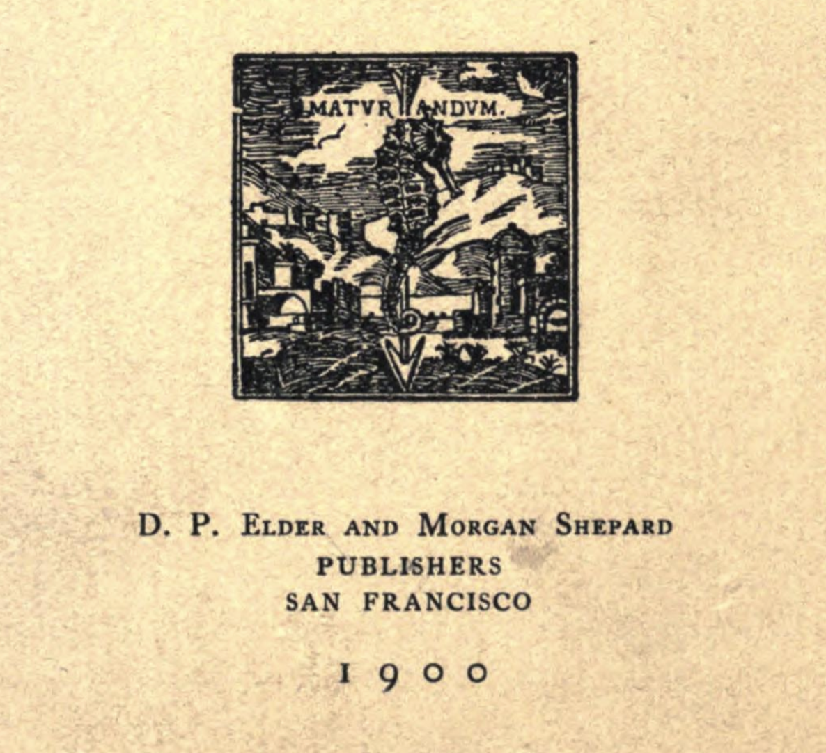
The earliest known stamp (A) dates from 1899, before Elder and Shepard began to use the tomoye. At this time, Elder was still calling himself “D. P. Elder.” The significance to Elder & Shepard of the seahorse-and-arrow design is unknown, but an interesting variant appears on the title page of Charles Ferguson’s Religion of Democracy, checklist #258. A seahorse appears over a vertical arrow, but with a village scene in the background and the motto “Maturandum” printed above. Literally, maturandum is Latin neuter singular gerundive of maturo and means for “that which is to be matured,” or “something requiring haste or maturing,” but is often coloquially rendered as “carefully” or “cautiously.”

Seahorse-and-arrow design on the title page of The Religion of Democracy

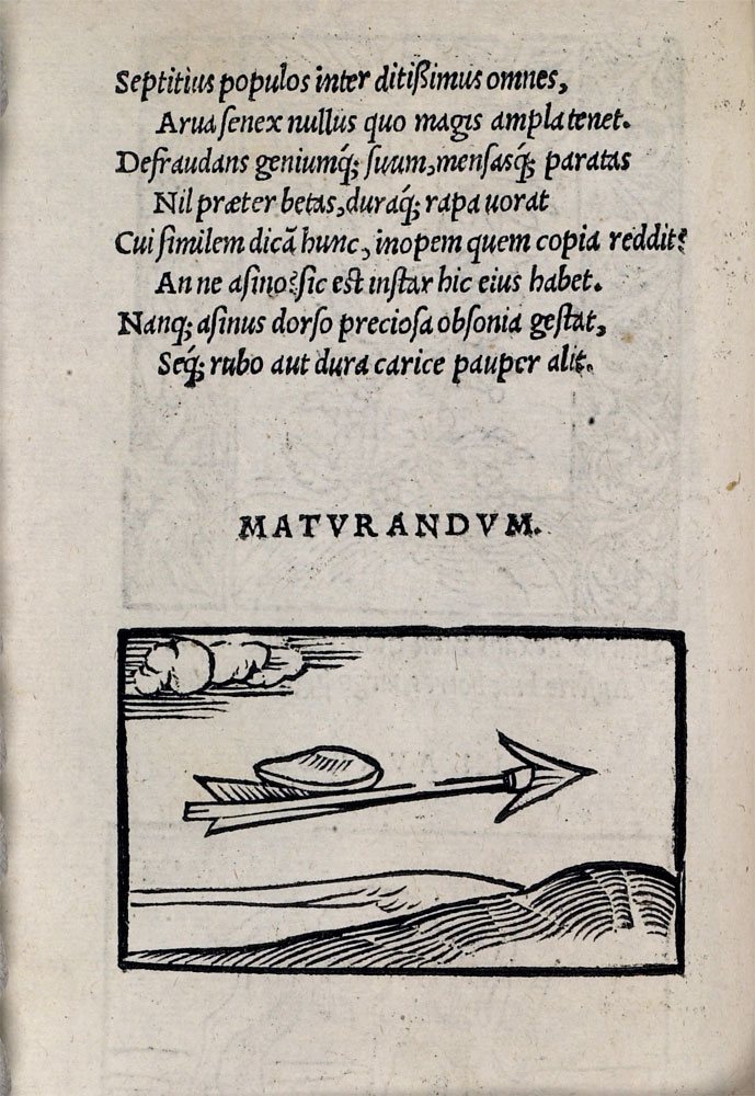
The image may ultimately derive from Emblematum liber, a book of emblems published in Augsburg, Germany in 1531. Here a mollusc is shown on a flying arrow with the text:

Maturare iubent propere et cunctarier omnes
Ne nimium praeceps neu mora longa nimis
Hoc tibi declaret connexum echneide telum
Haec tarda est, volitant spicula missa manu.

…which translates as: “Everyone tells us to deal with things quickly, but they also tell us to hold back – not to be impetuous, nor yet to wait too long. A missile linked with a sucking-fish can demonstrate this for you: the fish is slow, but arrows fly fast when they leave the shooter’s hand.”

Page C6 verso of Emblematum liber, with a seashell on a flying arrow

In any case, the seahorse-on-arrow era did not last very long. Elder and Shepard switched to the tomoye design in February 1900, principally on the title pages of their books and Impressions magazine. The earliest known example of the first tomoye stamp (B) is from 1901. 

Stamp C dates from 1902, when Elder began calling himself “Paul Elder.” This stamp was discovered in 2023 and is known from just this one example.

After Morgan Shepard left the partnership, Elder redesigned the stamps to read “Paul Elder & Company,” with customized stamps for each store. The San Francisco stamp had two variants, which I’m calling D1 and D2. I have seen only one example of D1 and assume therefore that it is the earlier of the two. Only one example of the Santa Barbara stamp (E) has been seen, analogous to stamp D2. It’s possible, though unlikely, that the New York store had had a stamp, as one has never been found.

Stamp F, featuring a tomoye surrounded by delicate tracery, had the longest lifespan; it has been seen as early as 1911 and as late as 1946.

Page C7 recto of Emblematum liber, with the accompanying text to the emblem at top

By the 1950s, much had changed. Paul Sr. died in 1948, and Paul Jr. moved the bookstore to the corner of Sutter & Stockton. The company now used self-adhesive stickers (G) with a decidedly modern look to match the decidedly modern store.

Updated 2026-07-12