The Raven

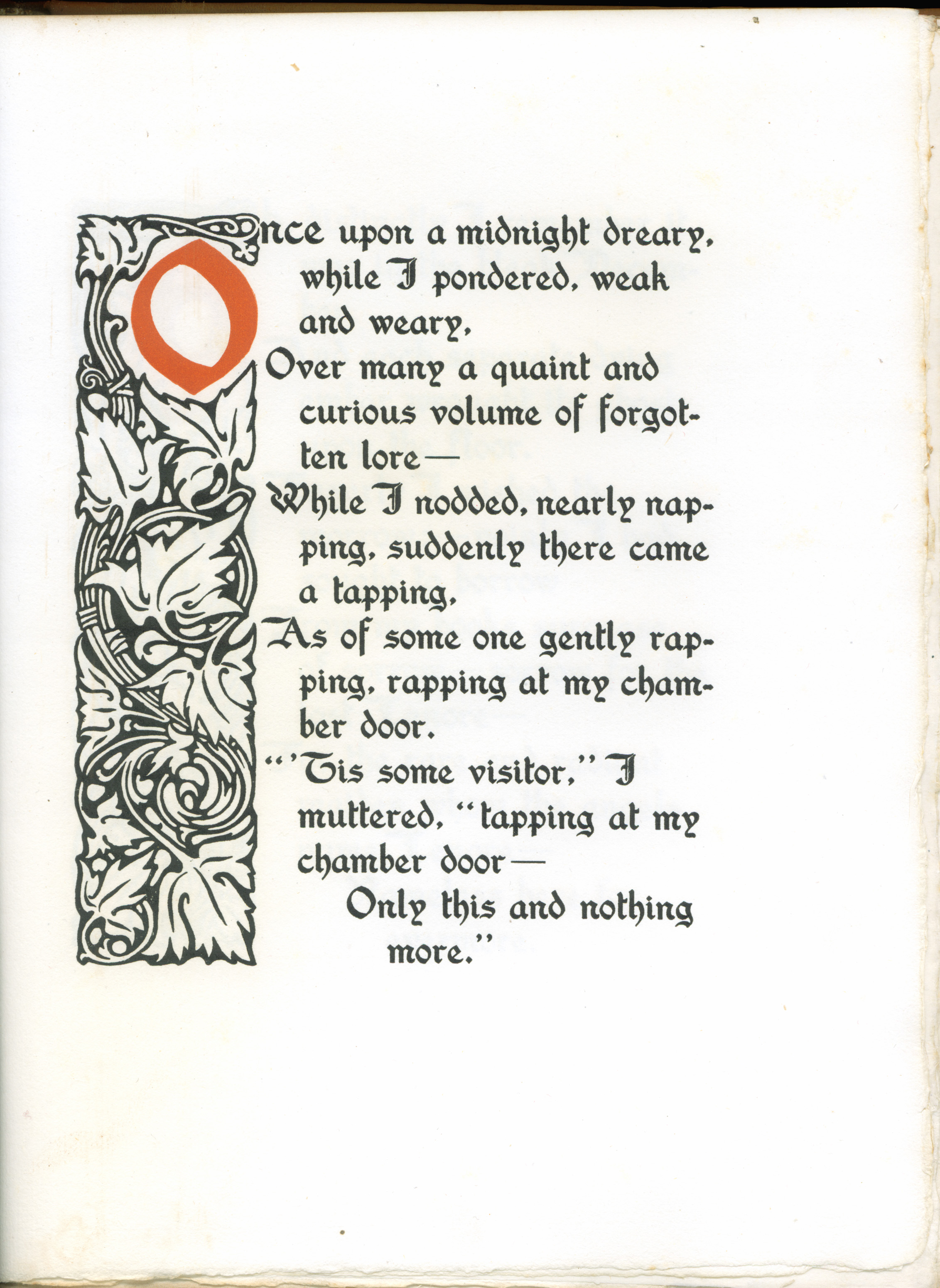
Once upon a midnight dreary, while I pondered, weak and weary,
Over many a quaint and curious volume of forgotten lore—
While I nodded, nearly napping, suddenly there came a tapping,
As of someone gently rapping, rapping at my chamber door.
“‘Tis some visitor,” I muttered, “tapping at my chamber door—
Only this and nothing more.”

Fancy suede binding of "The Raven"
Fancy suede binding of “The Raven”

When I was a child, we had a small book of poetry bound in blue boards. My mother enjoyed reading these poems to me, and Edgar Allen Poe’s “The Raven” was one of her favorites. I can still hear my mother beginning “Once upon a midnight dreary…”

The Raven” was published on 29 January 1845 in the New York Evening Mirror. It was an instant hit and made Poe famous, although it did not earn him much money. Nearly 170 years later, “The Raven” remains one of the best-known poems in the English language. It has appeared in numerous editions and is a favorite with illustrators. The poem has also been parodied many times; my favorite is “Ravin’s of a Piute Poet Poe,” by Charles Leroy Edson, published in the Saturday Review of Literature in 1925.

Title page of "The Raven"
Title page of “The Raven”

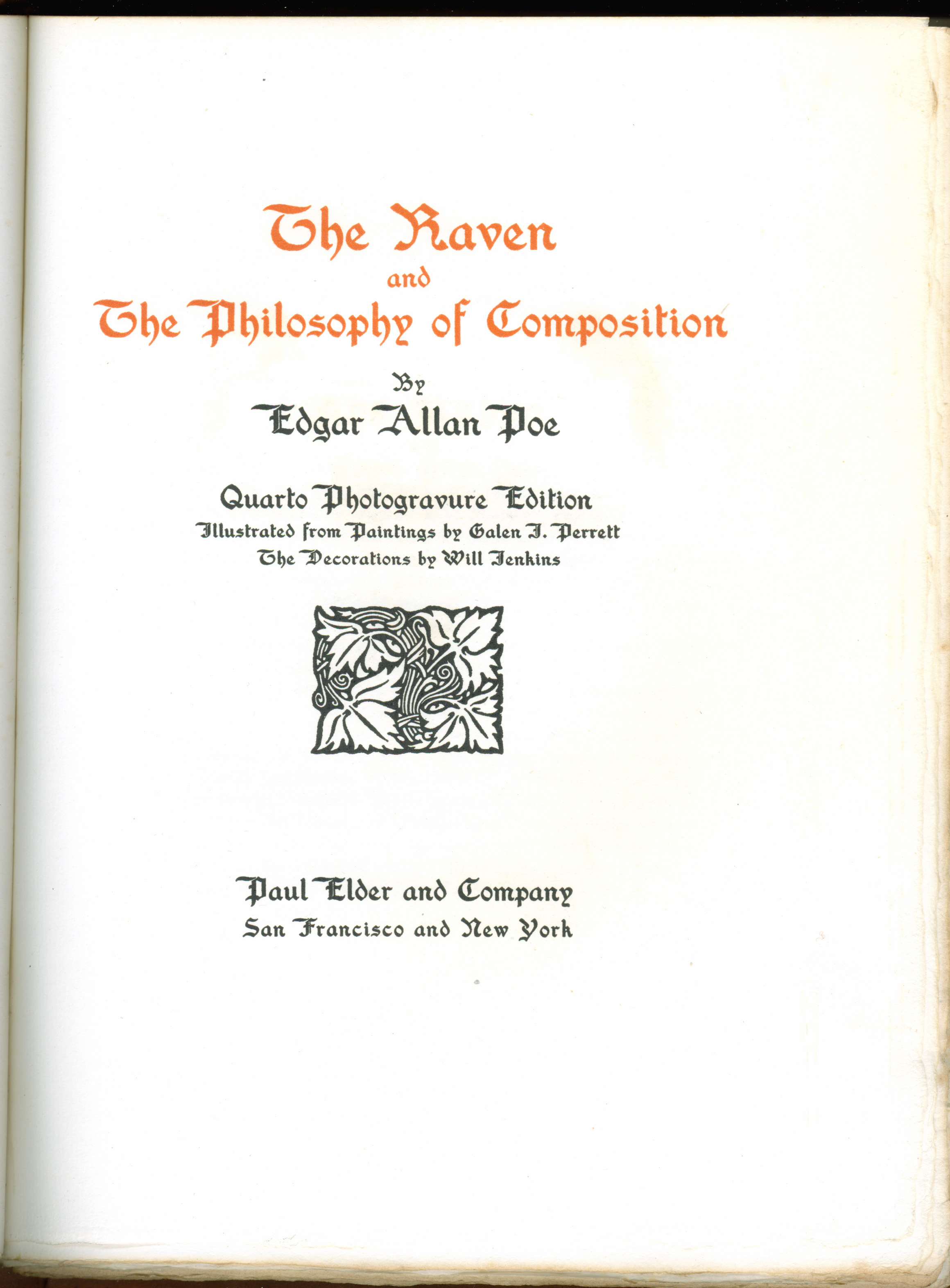
In 1846, the year after publishing “The Raven,” Poe wrote an essay entitled “The Philosophy of Composition,” in part to explain how he composed the poem (although it’s unclear whether Poe actually used the techniques himself). For example, Poe writes that “the death… of a beautiful woman … is unquestionably the most poetical topic in the world, and equally is it beyond doubt that the lips best suited for such topic are those of a bereaved lover.” Poe would feel this very anguish in 1847 when his wife Virginia died of tuberculosis. He himself died in 1849 under mysterious circumstances.

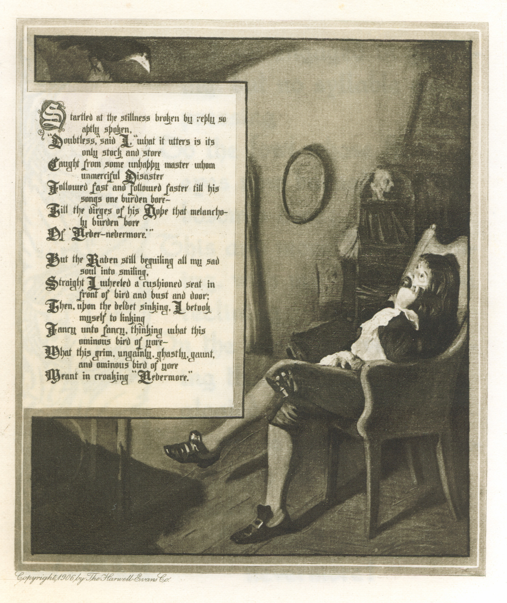
Elder’s edition of The Raven and the Philosophy of Composition is a beautiful one: a limited edition of 1000, in suede cover with title stamped in gold, matching dust jacket, two-color printing and imported handmade paper. On the other hand, the book was set in Washington Text, one of Elder’s favorite display types but a poor choice as a text type. Galen Perrett’s illustrations are Victorian in character, which conflict somewhat with the Arts & Crafts feel of the rest of the book. In addition, the illustrations are reproduced too small, so that the poem (included in the illustration) is difficult to read. Despite these flaws, it is a very handsome book.

First page of the poem
First page of "The Philosophy of Composition"
First page of “The Philosophy of Composition”
One of Galen Perrett's illustrations
One of Galen Perrett’s illustrations

Blottentots

Cover of "Blottentots"
Cover of Paul Elder & Co’s “Blottentots”

The craft of making art from inkblots is called klecksography (from klecks, the German word for “stain” or “blotch”). To a modern reader, inkblots will immediately call to mind the Rorschach Test, but as we shall see, the art of blots and blobs has a much longer history. Leonardo da Vinci wrote about how easy it was for any given splotch on a wall to turn into something else:

I will not refrain from setting among these precepts a new device for consideration which, although it may appear trivial and almost ludicrous, is nevertheless of great utility in arousing the mind to various inventions. And this is, that if you look at any walls spotted with various stains, or with a mixture of different kinds of stones, if you are about to invent some scene you will be able to see in it a resemblance to various different landscapes adorned with mountains, rivers, rocks, trees, plains, wide valleys, and various groups of hills. You will also be able to see divers combats and figures in quick movement, and strange expression of faces, and outlandish costumes, and an infinite number of things which you can then reduce into separate and well-conceived forms. With such walls and blends of different stones it comes about as it does with the sound of bells, in whose clanging you may discover every name and word you can imagine.1The Notebooks of Leonardo da Vinci, II, 250-51.

Page 7 of
Page 7 of Justinius Kerner’s “Klecksographien” (public domain)

The first person to publish a book using inkblots was Justinus Kerner (1786-1862), a German poet and medical writer, who was the first person to write a detailed description of botulism. Due to failing eyesight, Kerner would often accidentally drip ink onto his paper. Rather than throw away the resulting inkblots he decided to keep them as artwork, and wrote poems to accompany them. He finished the book Klecksographien in 1857 but it wasn’t published until 1890, twenty-eight years after his death.

In 1896, Albert Bigelow Paine (1861-1937) and Ruth McEnery Stuart (1849-1917) published “Gobolinks,” (a play on the words “goblin” and “ink”). Paine and Stuart envisioned Gobolinks as a game, where the players have five minutes to create an inkblot and then a poem to accompany it. Judges are chosen amongst the group, and they choose the best submissions;  players whose works are chosen then become judges for the next round, and the previous judges become players. After the proscribed number of rounds, the final judging is conducted.

Cover of Stuart and Paine’s “Gobolinks”

Enter Paul Elder & Company in 1907, with Blottentots, and How To Make Them. The book is certainly derivative, but the inkblots are creative and the verses delightful for youngsters’ ears. The author is John Prosper Carmel with calligraphy by Raymond Carter, but the former is believed to be a pseudonym of the latter. I have been unable to find any information about Mr. Carter.

In 1921, fifteen years after the publication of Blottentots, Hermann Rorschach (1884-1922) wrote his book Psychodiagnostik, which was to form the basis of the test which bears his name. Some have suggested that Rorschach (who was nicknamed “Klecks” in his youth because of his fondness for inkblots) based his work on Kerner’s, but there appears to be no conclusive evidence of this.

Updated 2025-12-22

The rules of Gobolinks
Page 3 of Gobolinks
Page 3 of Gobolinks
Frontispiece and title page of "Blottentots"
Frontispiece and title page of “Blottentots”
Pages 2-3 of "Blottentots"
Pages 2-3 of “Blottentots”
Pages 22-23 of "Blottentots"
Pages 22-23 of “Blottentots”
The first of the ten cards in the Rorschach test


  • 1
    The Notebooks of Leonardo da Vinci, II, 250-51.

An Alphabet of History

Cover of "An Alphabet of History"
Cover of “An Alphabet of History”

In 1905, Paul Elder published Wilbur Nesbit’s An Alphabet of History, a large-format volume of verse for adults. In contrast to some other humorous verse issued by Elder, Nesbit’s poetry has survived the last century in fine shape to be appreciated by the modern reader.

Wilbur D. Nesbit was born in Xenia, Ohio in 1871. He started as a printer before becoming a reporter for his hometown newspaper, the Cedarville Herald. Nesbit spent the rest of his career in journalism, writing for newspapers in Muncie, Indianapolis, and Baltimore before moving to Chicago. He wrote a column for the Chicago Tribune called “A Line o’ Type or Two,” and was later on the staff of the Chicago Evening Post. Along the way he began composing poetry. Nesbit was also in demand as a toastmaster, and was a long-time member of the “Forty Club,” a Chicago version of San Francisco’s Bohemian Club. Nesbit wrote a history of the Forty Club in 1912.

Title page of "An Alphabet of History"
Title page of “An Alphabet of History”

Nesbit’s best known work was a short patriotic poem “Your Flag and My Flag,” first published in the Baltimore American in 1902. It was described as having “a ring of national sentiment that rivals the ‘Star Spangled Banner’ itself.”1The National Magazine, Boston, May 1917, p304-5.. The poem was frequently recited in schoolrooms, and also at political conventions and Congressional sessions.

The delightful drawings are by the artist Ellsworth Young (1866-1952), who in addition to book and magazine illustrations, was a noted landscape painter and poster artist. He studied at the Art Institute of Chicago and later worked for the Works Progress Adminitration (WPA) during the Depression.

Updated 2025-12-20

Wilbur Nesbit


Frontispiece of "An Alphabet of History"
Frontispiece of “An Alphabet of History”
"An Alphabet of History," letter K
“An Alphabet of History,” letter K
"An Alphabet of History," letter S
“An Alphabet of History,” letter S
"An Alphabet of History," letter Z
“An Alphabet of History,” letter Z
  • 1
    The National Magazine, Boston, May 1917, p304-5.

Poem Delivered at the Dedication of the Pan-American Exposition

Cover of "Poem Delivered..."
Cover of Poem Delivered

The Pan-American Exposition was originally scheduled for 1897 on Cayuga Island, New York, a few miles upstream from the huge tourist attraction of Niagara Falls. But when the Spanish-American War broke out in 1898, the fair was delayed. The City of Buffalo then took the opportunity to compete for the privilege of hosting the fair, which it won by virtue of its larger population (350,000 people, then the eighth-largest city in the United States) and better railroad service. The fair was held in May-November 1901 in the neighborhood known as Delaware Park.

The Exposition was a big success, and more than eight million visitors attended. Today, the Fair is remembered chiefly as the site of President William McKinley’s assassination on 6 September 1901. But before that momentous event, the biggest novelty was electricity: the fair was lit at night by Nicola Tesla’s new three-phase alternating current, powered by Niagara Falls, twenty-five miles away.

Robert Cameron Rogers (1852-1912)
Robert Cameron Rogers (1862-1912)

Robert Cameron Rogers (7 January 1862–20 April 1912) was born in Buffalo, and graduated from Yale in 1883. His father, Sherman Skinner Rogers, was one of the most prominent lawyers in Buffalo, and Robert spent a year in his father’s firm before deciding that law was not for him. Instead, he turned to writing, and published books, poems and magazine articles. His 1898 poem “The Rosary” was set to music several times, most notably by Ethelbert Nevin, and sold very well as sheet music.

Also in 1898, Rogers moved to Santa Barbara, where he married Beatrice Fernald, the daughter of former Santa Barbara mayor Charles Heard Fernald. In 1901, he purchased The Morning Press newspaper, which he molded into one of the most influential and best-edited papers in California. Back in Buffalo, when it came time to select a poet to write a dedicatory poem for the Exposition, no doubt it was the well-connected Sherman Rogers who secured the honor for his son Robert.

Aerial view of the Pan-American Exposition in Buffalo NY

At first glance, it is perhaps surprising the small San Francisco firm of Elder & Shepard should publish this volume, especially since New York City, the undisputed center of American publishing, was so close to the Exposition. This was very likely due to Morgan Shepard’s Santa Barbara connections, perhaps his sister-in-law Katherine Putnam, author of Wayfarers in Italy.

Poem Delivered at the Dedication of the Pan-American Exposition is a slim booklet, 16 pages and 8 x 5.5″ in size, printed on deckle-edge paper. The cover and title page feature a tomoye design, though the tomoye has no connection with the poem or the Exposition. The tomoye had only recently been chosen as a logo by Elder & Shepard, and they were clearly trying to establish their brand.

Rogers died in Santa Barbara in 1912 from complications of an appendicitis operation, just 50 years old.

Updated 2025-01-10

Title page of "Poem Delivered..."
Title page of Poem Delivered
Page 1 of "Poem Delivered..."
Page 1 of Poem Delivered

The Standard Upheld

Cover of The Standard Upheld

During their five-year collaboration between 1898 and 1903, Morgan Shepard was the artist, decorator and poet, while Paul Elder was the businessman and bookseller. Elder & Shepard published six of Shepard’s works during that time, mostly children’s stories. The prettiest of them is his slim volume of poetry The Standard Upheld, published in 1902 in a limited edition of 550 copies. Shepard’s title page design, perhaps depicting eucalyptus leaves, can be compared to similar botanic artwork on Volumes 1 and 2 of Impressions magazine. Shepard perhaps also designed the illuminated capital S on page 1.

The opening poem, “Shall I Cast Down the Standard Of My Life?” is clearly autobiographical. In a short memoir he wrote in his eighties, Shepard described the early death of his mother, followed by teenage years full of bad breaks, disappointments, and fisticuffs. For Morgan Shepard, the metaphor of “me against the world, holding my standard high” is an apt image indeed.

Standard Upheld title
Title page of The Standard Upheld

Copy #1 of The Standard Upheld was presented by Shepard to Thomas Coke Watkins, to whom he dedicated the book. Shepard had it specially bound by Henry W. Thumler and James A. Rutherford, whose shop at 538 California was about three blocks from Elder & Shepard’s bookstore. Thumler & Rutherford were frequent advertisers in Impressions magazine.

Updated 2026-01-08

Standard Upheld cover
Copy #1 of The Standard Upheld, bound by Thumler & Rutherford
Standard Upheld p01
Page 1 of The Standard Upheld, and the poem from which the book’s title is taken
Standard Upheld p10
Pages 10-11 of The Standard Upheld